At a glance
-
4
months from discovery to launch
-
6
sections in the new navigation, from gifts to accessories
-
Level A
ADA compliance, with a high score in screen-reader testing
The brief
Make Montblanc the “number 1 digital destination for Men's accessories”. That meant a complete redesign of montblanc.com, discovery to launch in four months.
The challenge
The site had to work across devices, mobile first, and perform better on search, conversion and load times. Navigation and filters needed work, editorial and product landing pages needed to be modular, and the whole site needed a clean-up.
Underneath it all: link luxury values with performance, and turn users into buyers and returning customers.
My role
My experience department at Born ran this work. I set the strategy and led the research and workshops with the team.
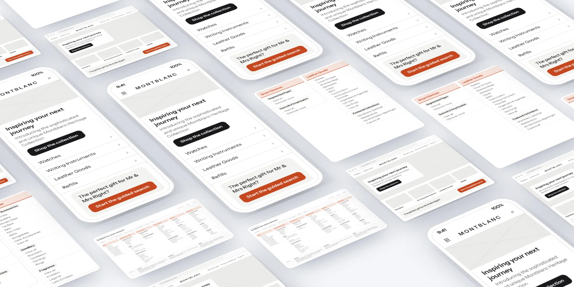
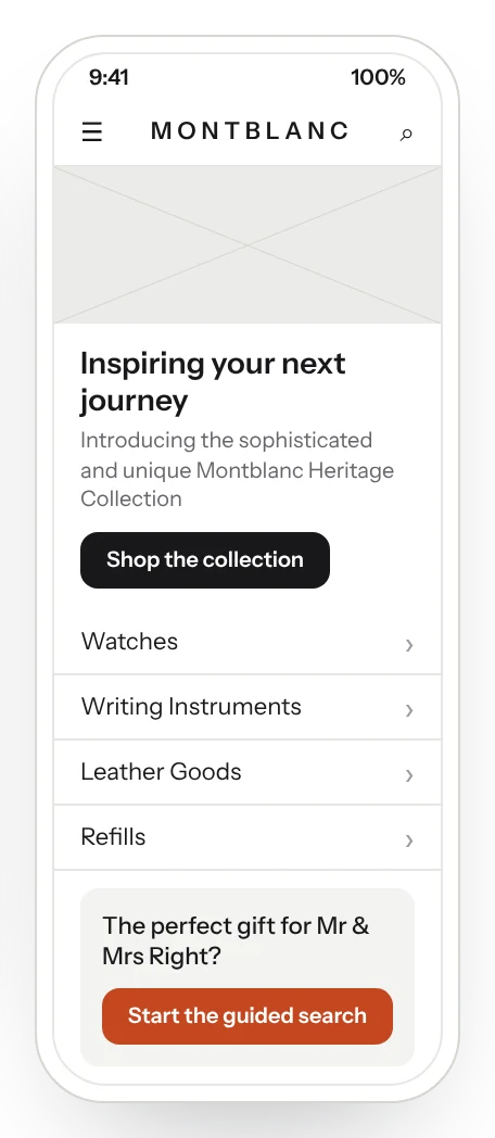
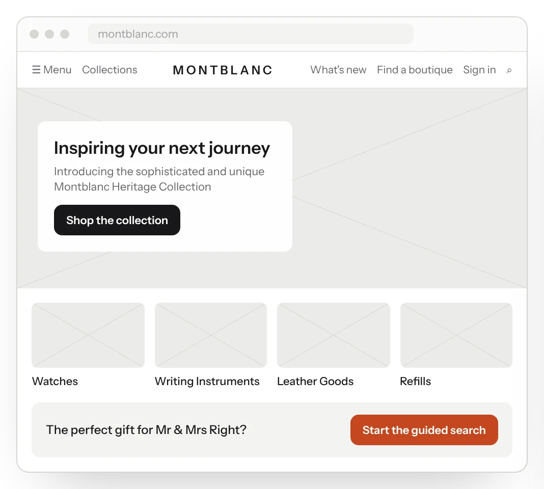
I articulated it through the navigation, wireframes and designs for the new site, across desktop and mobile.
What we did
- Redesigned montblanc.com in four months, discovery to launch.
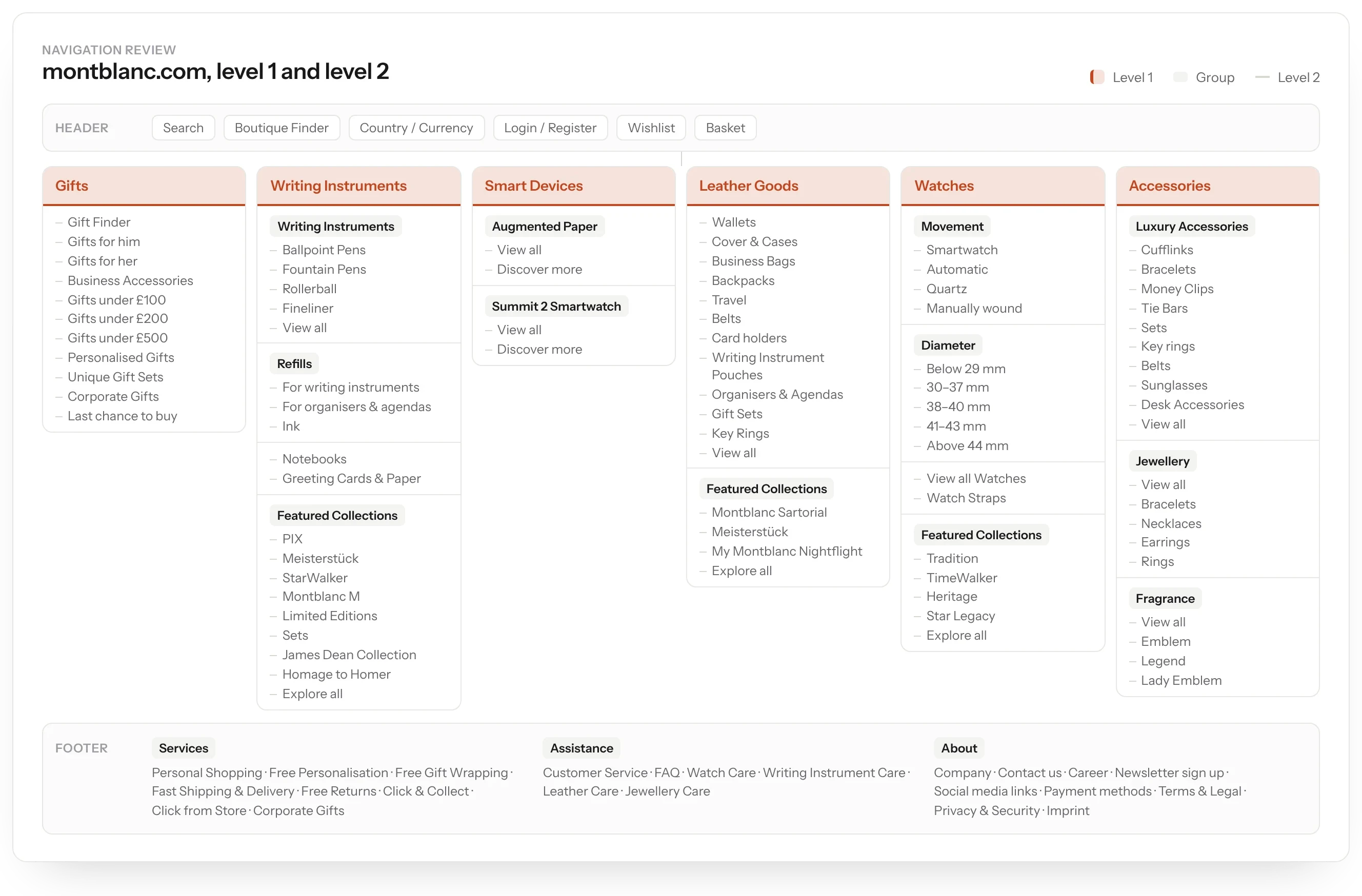
- Rebuilt the navigation around gifts, writing instruments, smart devices, leather, watches and accessories.
- Designed mobile first, with modular editorial and product landing pages.
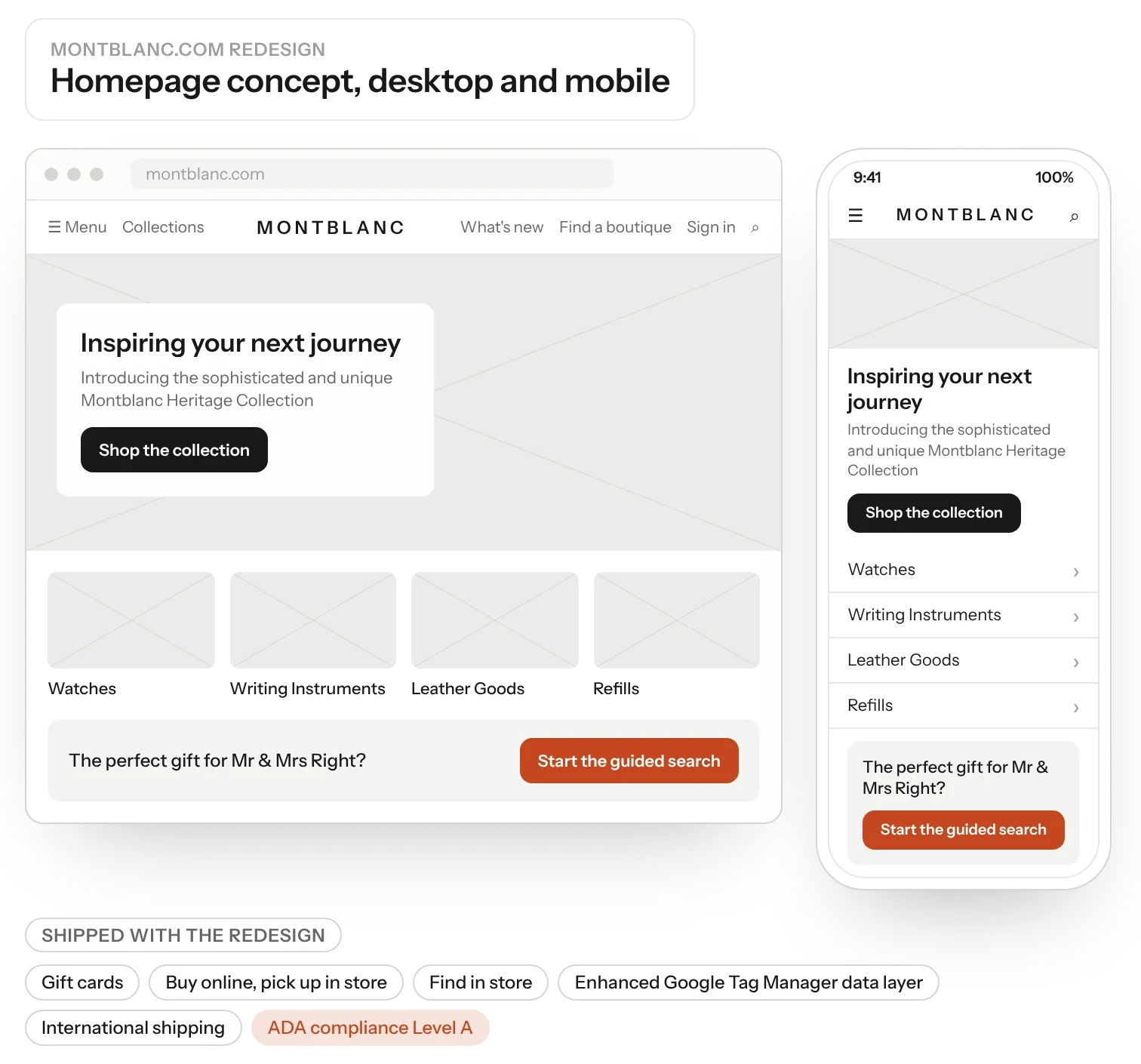
- Added gift cards, buy online and pick up in store, find in store and international shipping.
- Met ADA Level A, with a high score in screen-reader testing.
The redesign
We took montblanc.com from discovery to launch in four months, with a complete redesign. The new site added gift cards, buy online and pick up in store, find in store, international shipping and an enhanced data layer for analytics.
Navigation
The navigation was rebuilt around six sections: gifts, writing instruments, smart devices, leather goods, watches and accessories. Each has clear second-level groups, from gift ideas by price to watch movements and case sizes, with services and assistance in the footer.
Accessibility
Accessibility was part of the brief, not an afterthought: the site met ADA Level A with a high score in screen-reader testing.
The result
montblanc.com launched four months after discovery began: fully redesigned, mobile first, and meeting ADA Level A with a high screen-reader score.