At a glance
-
~70%
of clients held a single policy: the opportunity in the brief
-
~5%
growth a year in rounded-out clients
-
Double digits
growth in use of Chubb's digital channels after launch
What we did
- Turned a growth brief into an experience vision, with KPIs, front and backstage journeys and a roadmap.
- Ran focus groups with brokers and interviews with underwriters, and drew on research with affluent clients.
- Set design principles for clients who expect their broker to handle everything.
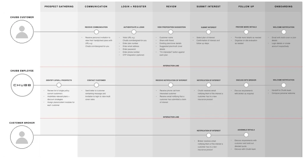
- Mapped the service in interaction blueprints: broker approval, client communication, underwriting and appraisal.
- Designed and tested the new website in batches, with two rounds of usability testing.
- Grew the work into two tracks, Expect More and Prospecting, and early concepts for a broker portal and member portal.
The brief
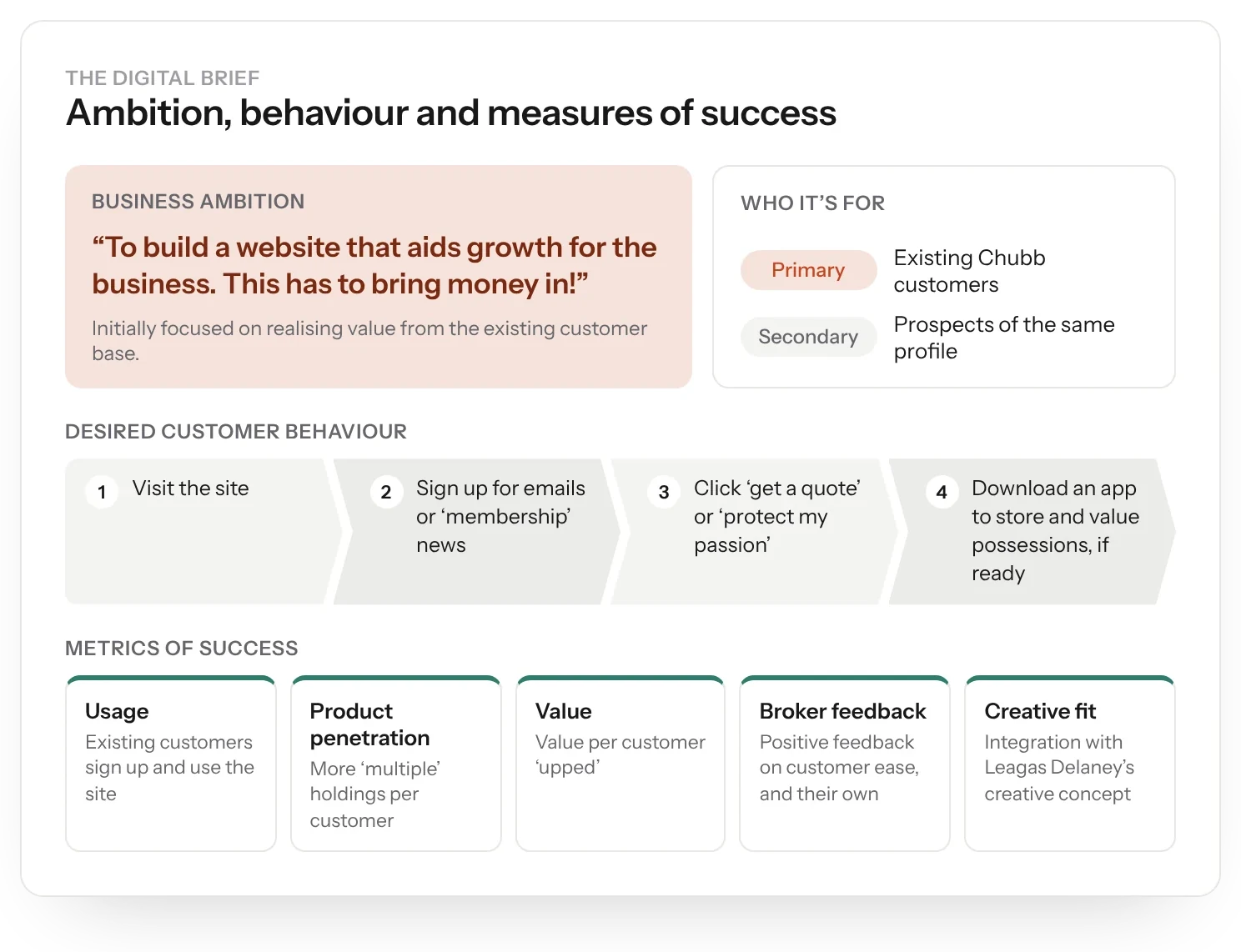
Build a website that helps Chubb Private Clients grow. In the brief's own words: “This has to bring money in!” Around 70% of clients held a single policy, so the opportunity was clear.
Success meant more customers signing up, more policies and more value per customer, positive feedback from brokers, and a fit with Leagas Delaney's creative concept.
The challenge
Chubb's clients are high and ultra-high net worth, and they deal with Chubb through brokers. That's good for loyalty, but hard for change. Research showed many clients had already stepped back by appointing a broker: “He does it all – that's why you have a broker so you don't need to think about it.”
My role
My experience department at Born ran this work. I set the experience strategy and led the workshops and research synthesis with the team.
I articulated it through the experience vision, service blueprints, wireframes and designs tested in two rounds of usability testing, and early concepts for broker and member portals.

Listened to brokers and clients
We ran focus groups with brokers and SMEs to see how they handle high-stakes decisions with clients, where tools and reporting fell short, and what good communication with Chubb looked like.
Research with affluent clients showed why they pay more for Chubb: “to know that there are no loopholes”. It also found a younger, city-based segment worth designing for.

Set the principles
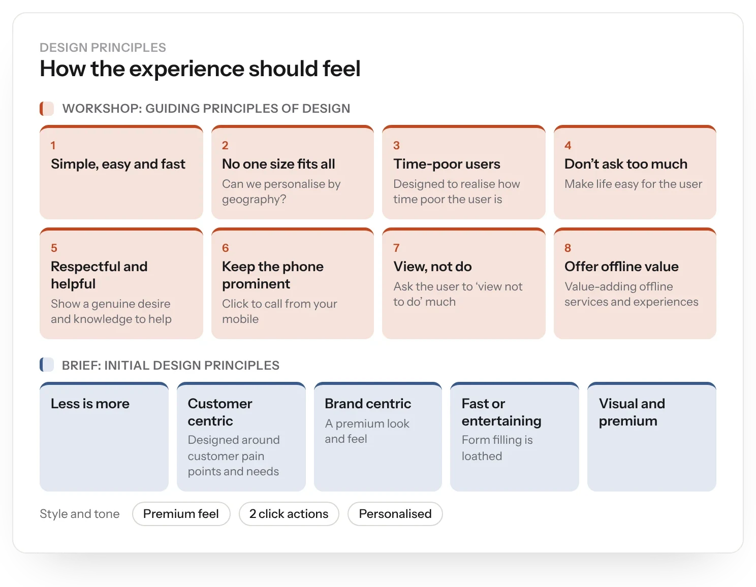
The principles kept us honest: simple, easy and fast. No one size fits all. Don't ask too much. Keep the phone number prominent. “View, not do.” And offer valuable services offline, not just on screen.
The brief added its own: less is more, two-click actions, visual and premium, and personalised.
Mapped the service
Service interaction blueprints showed how broker approval, client communication, underwriting and appraisal fit together, and where the business KPIs sat.
Five themes came out of it: give brokers more tools to grow, improve communication and reporting between Chubb and brokers, improve data through digital, explore direct client touchpoints carefully, and help underwriters and brokers work together with less friction.
Designed and tested
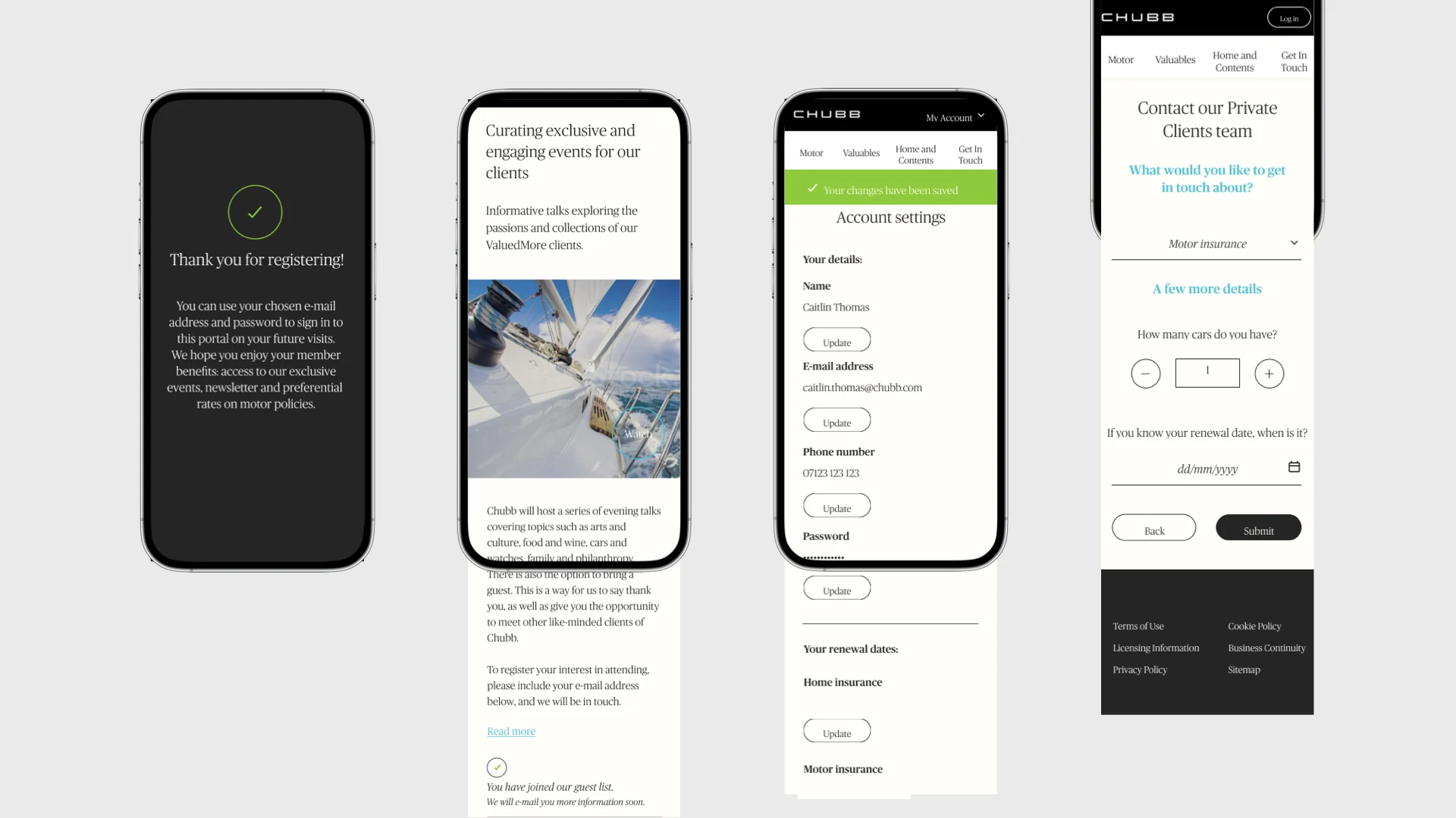
We designed in batches, wireframes then visual design in InVision. Every comment from the first batch was tracked and closed.
Annotated wireframes, A/B tests and event tracking were planned alongside, and two rounds of usability testing checked the designs with real people.
Grew the programme
The work grew into two tracks. Expect More focused on existing clients. Prospecting went after new ones, starting from the fact that UK homes are typically under-insured by up to 30%.
The website then became part of a multi-agency taskforce, alongside direct mail and media, including new website and landing page UX, design and production.
Looked further ahead
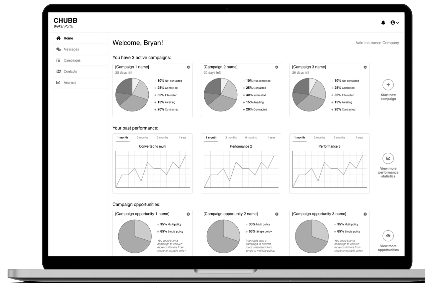
The long-term vision was a membership portal. Early concepts explored a broker portal for campaigns and conversion, and a member portal with a vault of possessions, editorial, broker messaging and quote requests.
The result
- Rounded-out clients grew by around 5% a year.
- Use of Chubb's digital channels grew by double digits after launch.