At a glance
-
4
weeks for a blue sky review of the whole web platform
-
12
gaps, each ranked must, should or could against effort
-
7
musts among the gaps, three of them low effort
-
16,000
SKUs, and up to 32,000 orders a day, on the platform under review
The brief
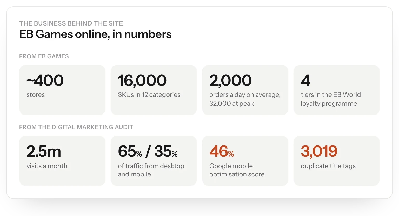
EB Games sells games, consoles and accessories through around 400 stores and its website. It builds everything in-house, on its own platform. It asked Born for a blue sky review of the whole web platform: a full digital journey, a platform recommendation and an omnichannel roadmap, in four weeks.
The challenge
The site worked well and was rich in features, but it was old in architecture and old in look. Moving to a new platform was a big risk for a business handling 16,000 SKUs and up to 32,000 orders a day. The review had to show clearly what was holding the site back and what to fix first.
My role
I was Head of User Experience at Born, and my experience department ran the UX and creative side of the review alongside Born's content, marketing and technology teams. I wrote the UX and creative gap report.
I articulated it through twelve gaps, each ranked must, should or could against effort, benchmarked against competitors such as Mighty Ape, with a recommendation for every one.
What we did
- Sent EB Games a questionnaire covering technology, marketing, creative, content and infrastructure.
- Benchmarked the site against Mighty Ape, JB Hi-Fi and Harvey Norman.
- Reviewed global elements, the homepage, listings and product pages on desktop and mobile.
- Ranked twelve gaps by priority and effort, with a recommendation for each.
- Joined our findings with a digital marketing audit of search, social, paid media and email.
Questions first
With four weeks to deliver, we started by asking. The answers set the scene: a bespoke ASP.NET site with no commerce framework, Lucene search, an in-house IT team of 18 and a preference for Demandware. Store staff fulfilled pickup orders by hand from the nearest store.
EB World, the free loyalty programme, was gamified: members level up through four tiers by earning carrots for buying, preordering and trading.
Gaps and priorities
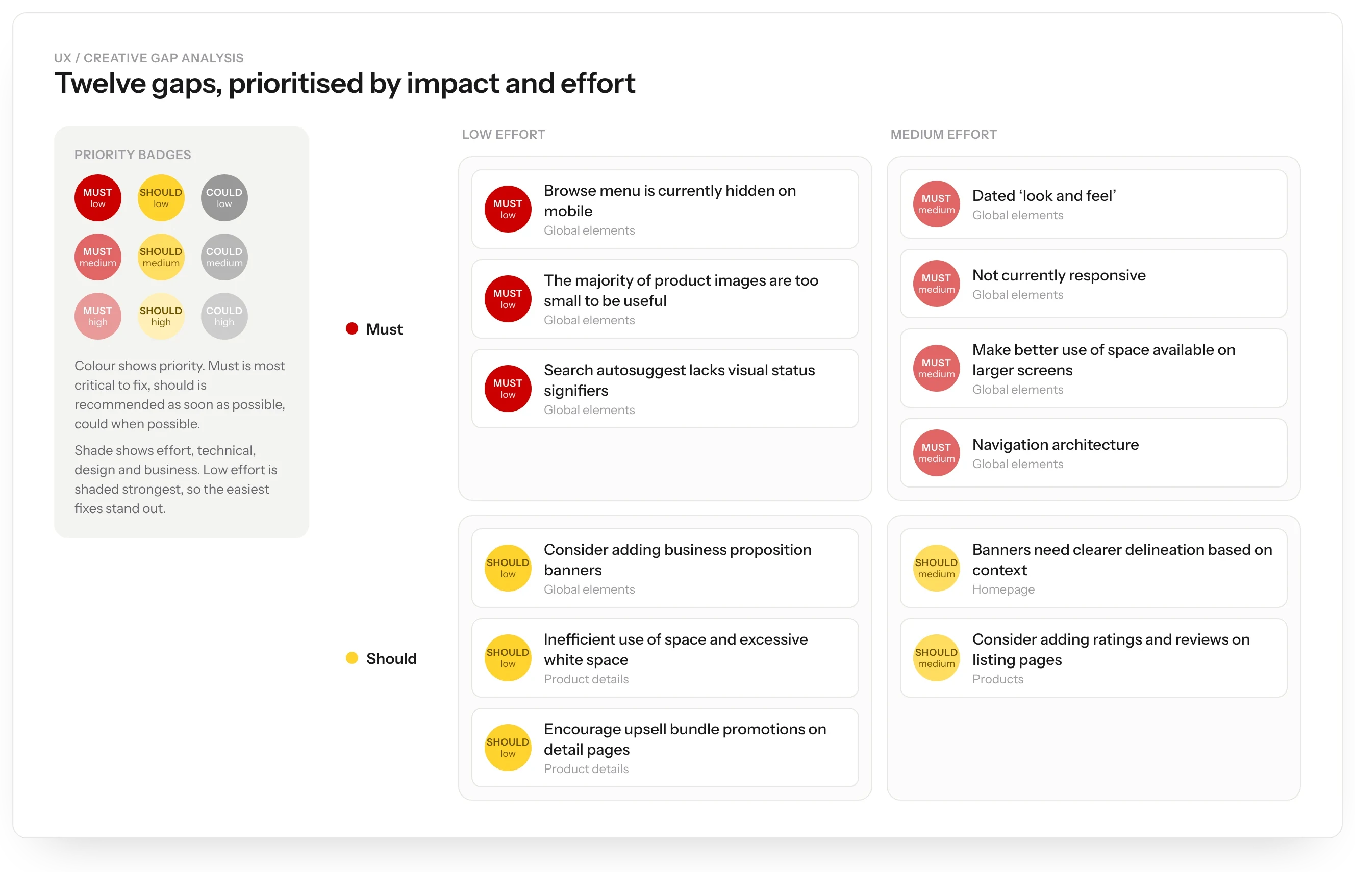
The report gave every gap a badge. Colour showed priority: must in red, should in yellow, could in grey. Shade showed effort, with the easiest fixes shaded strongest so they stood out. Of twelve gaps, seven were musts and three of those were low effort.
Mobile and navigation
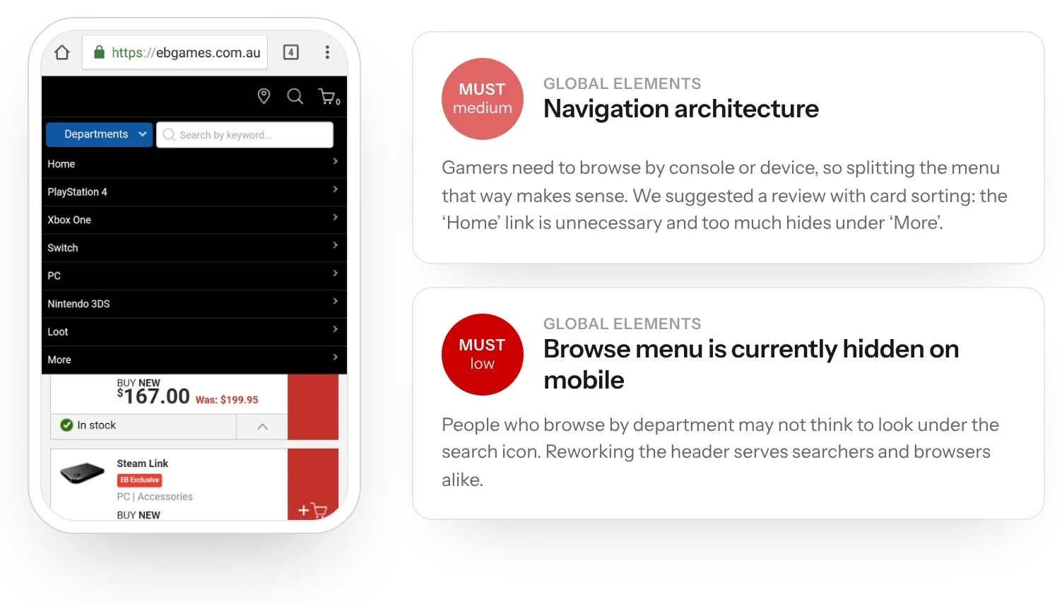
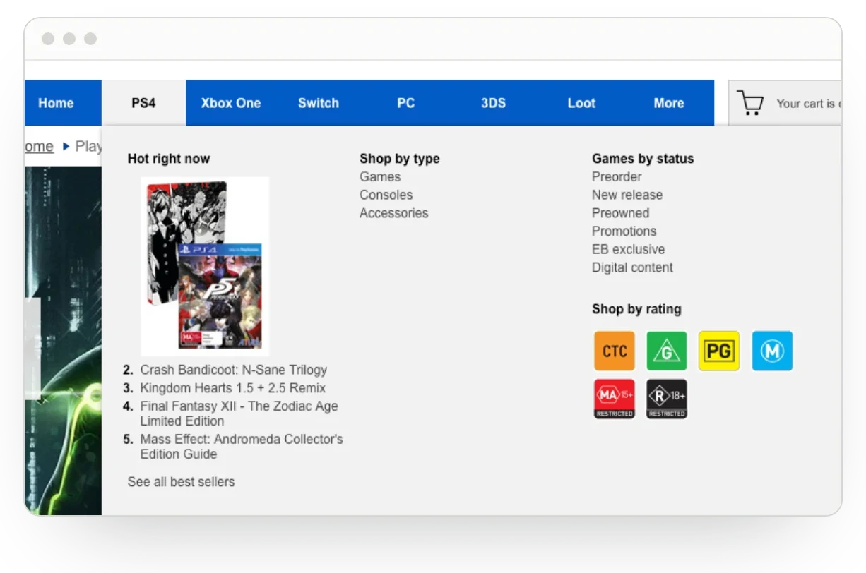
All seven musts were global. The site was not responsive and looked dated next to Mighty Ape. Industry figures showed 92.7% of users had a higher resolution than the site was designed for, so space was wasted. On mobile, the browse menu sat behind the search icon, where people who browse may never look. Product images were too small to be useful, and search autosuggest gave no sign that anything was loading.
We recommended a living style guide, a wider responsive layout, a reworked header and card sorting to test the navigation.
Selling better
The shoulds were about conversion. Homepage banners needed clearer grouping. Banners could celebrate EB World and delivery options. Ratings and reviews would reassure casual gamers and gift buyers, if they felt active. And product pages had room for bundles, such as a similar title, DLC or a figurine, as Mighty Ape did.
Marketing audit
Born's digital marketing audit completed the picture. The site drew 2.5m visits a month, 75% of them from search and direct. 35% came from mobile, yet Google scored mobile optimisation at 46%. There were 3,019 duplicate title tags and no blog. The audit pointed to SEO, content, email automation and paid media as the next steps.
A fun brand that offers the best service and is an authority on gaming.
The result
This was a review. It gave EB Games a ranked list of what to fix, starting with the musts that cost least, and a shared view of the site's UX, creative and marketing gaps to inform the platform decision and the omnichannel roadmap it had asked for.