The brief
Tata CLiQ needed its marketplace to convert better while it grew into new categories and a new app. That meant three pieces of work: a usability review to find quick wins, wireframes for a new eyewear category, and design for the app.
The challenge
Shoppers in India compare products across sites before they buy, so every point of friction costs a sale. On mobile there was no route to second and third-level categories, and search gave no feedback while it loaded.
My role
I was Head of User Experience at Born, and my experience department ran this work. I set the UX strategy and led the research with the team.
We delivered a quick-wins usability report, Axure wireframes for eyewear, jewellery and e-gift vouchers across desktop, tablet and mobile, and app designs with motion prototypes.
What we did
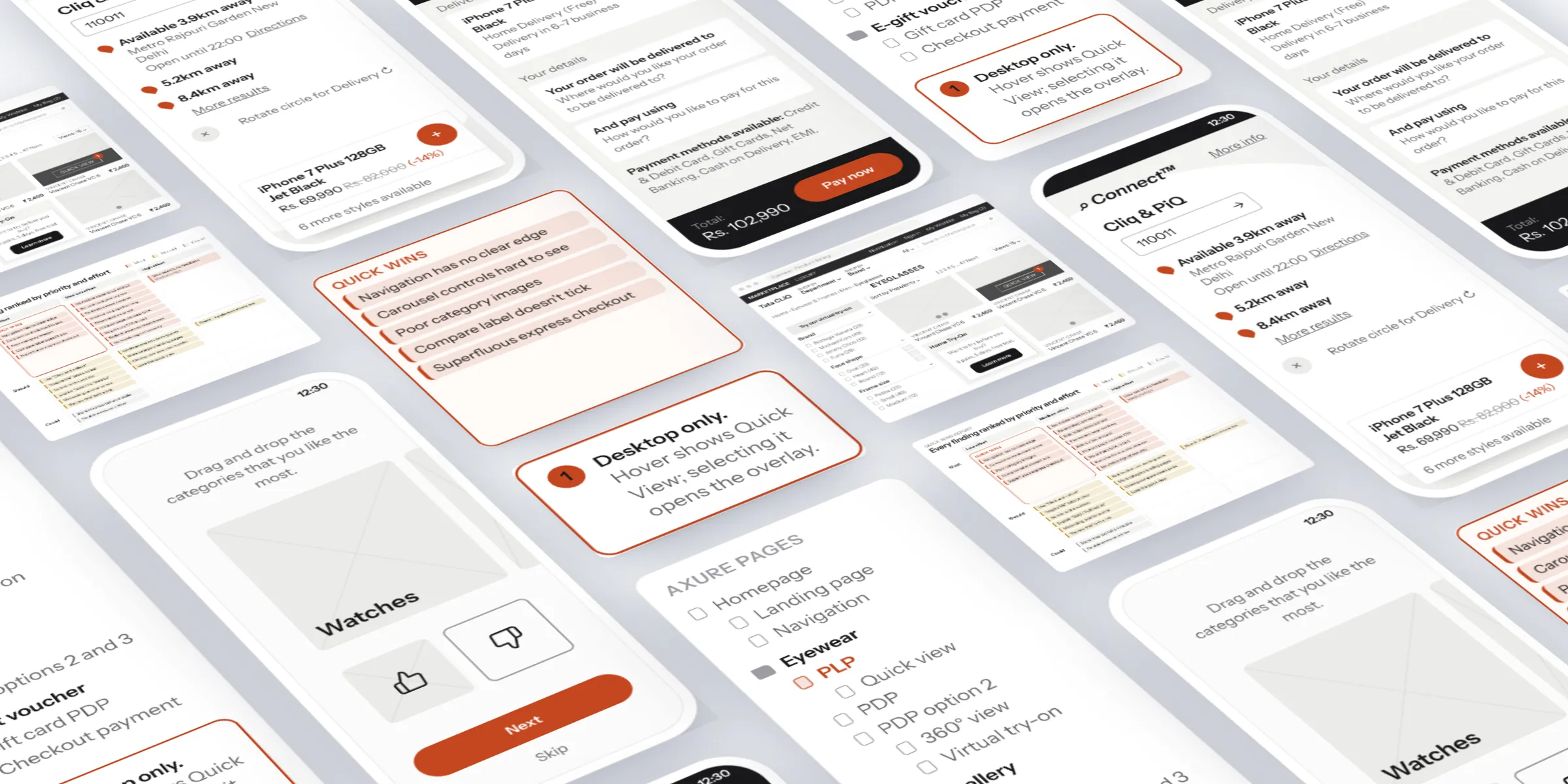
- Reviewed the marketplace end to end (navigation, home, landing, listing, product and checkout) and ranked every fix as must, should or could against effort.
- Wireframed a new eyewear category in Axure, from v1.0 to v1.5, adding tablet and mobile along the way.
- Designed eyewear for buying with confidence online: 360° views, virtual try-on, home try-on, e-gift vouchers and quick view.
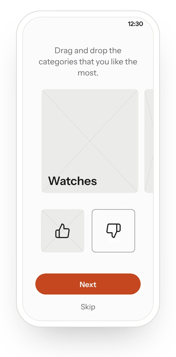
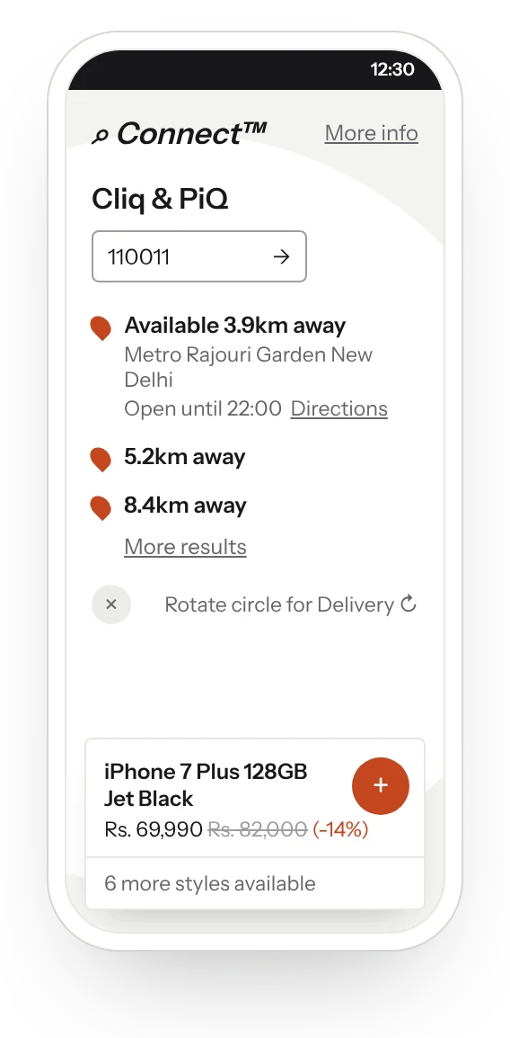
- Designed the app: an onboarding profiler, a personal feed, voice and predictive search, brand landings and a product page showing stock nearby.
- Prototyped contextual navigation in Principle to test the motion before build.
Quick wins review
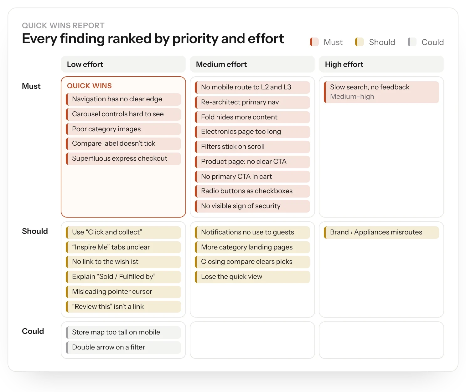
The review took the marketplace page by page: navigation, home, landing, listing, product and checkout. Each finding was ranked must, should or could and set against effort, so the team could ship the cheap, high-value fixes first.
Some of the biggest were simple. Mobile navigation had no route to second and third-level categories. Search autosuggest was slow and gave no feedback. And the site said “Omni Channel” where customers would understand “Click and collect”.
Eyewear category
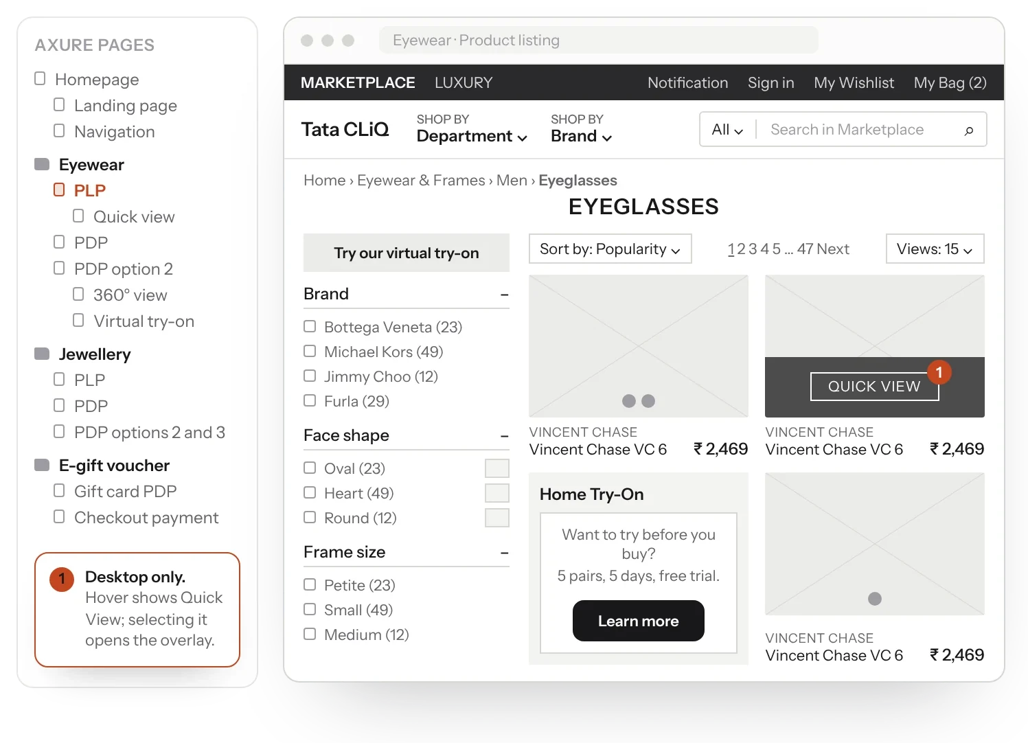
Glasses are hard to buy without trying them on. The eyewear wireframes went from v1.0 to v1.5, adding tablet and mobile along the way.
The category brought together 360° views, virtual try-on, home try-on, e-gift vouchers and quick view, with a switch between the Marketplace and Luxury experiences. We wireframed jewellery too.
App design
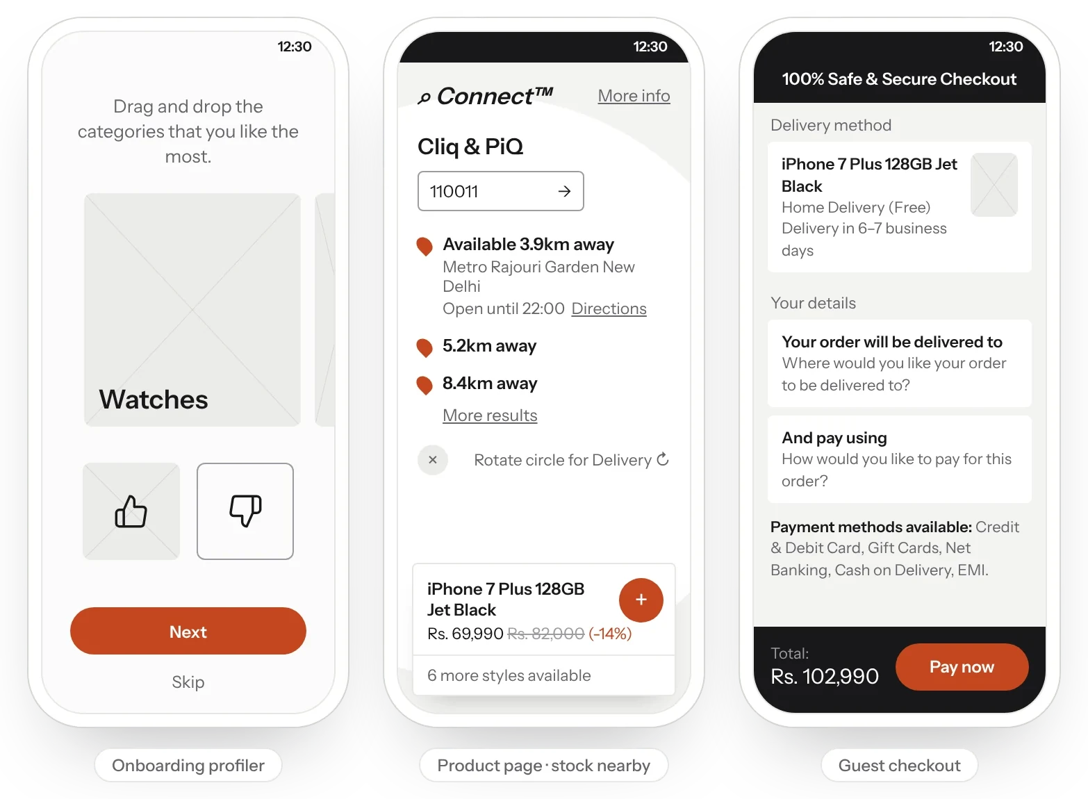
The app opened with a short profiler to shape a personal feed. Voice and predictive search, category and brand landings, and filters and sort led to the product.
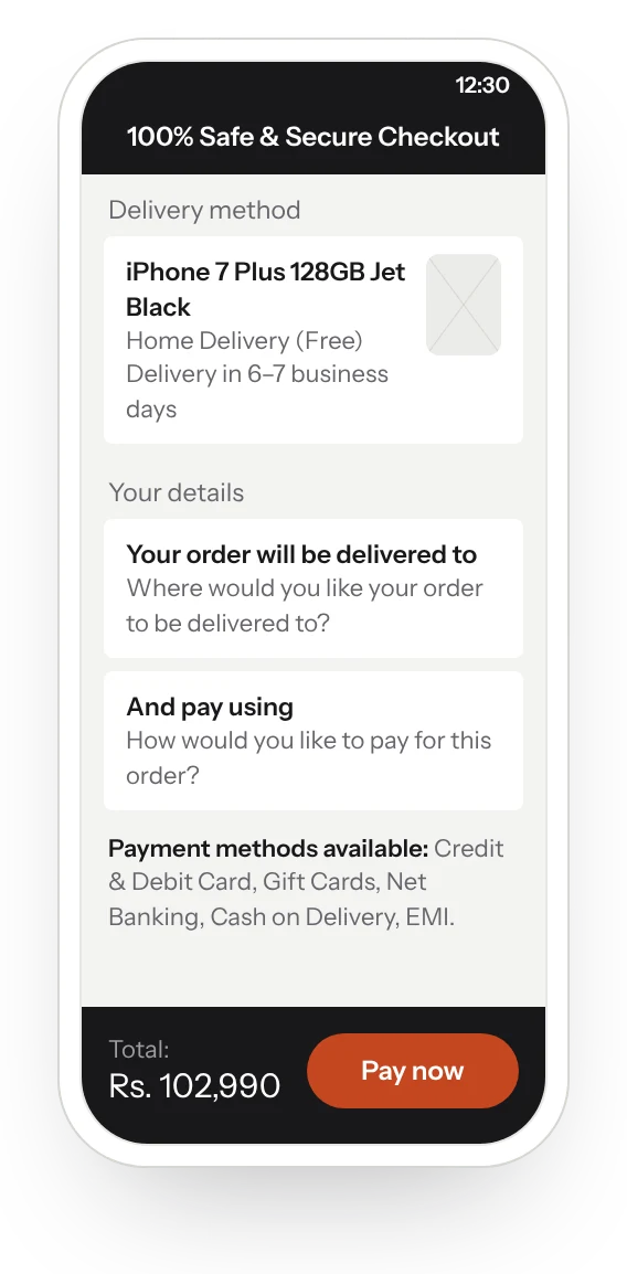
The product page connected online and in store through Cliq & PiQ, showing when an item was available nearby, for example “Available 3.9km away”. Checkout covered the ways people in India pay: cards, gift cards, net banking, cash on delivery and EMI.
We prototyped contextual navigation in Principle to get the motion right before build.
The local browsing/buying behaviour of users in India comparing products from different sites doesn't go unnoticed.
The result
A prioritised list of fixes the team could ship straight away, starting with the cheap, high-value ones. A new eyewear category, with jewellery and e-gift vouchers, designed for desktop, tablet and mobile. And an app that joined online shopping to nearby stores, from the first profiler screen to a checkout built for how India pays.