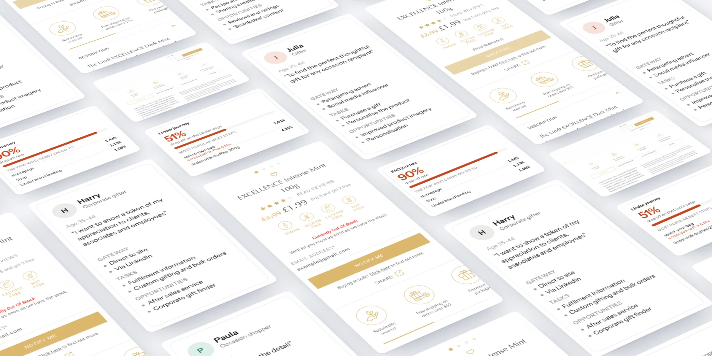
At a glance
-
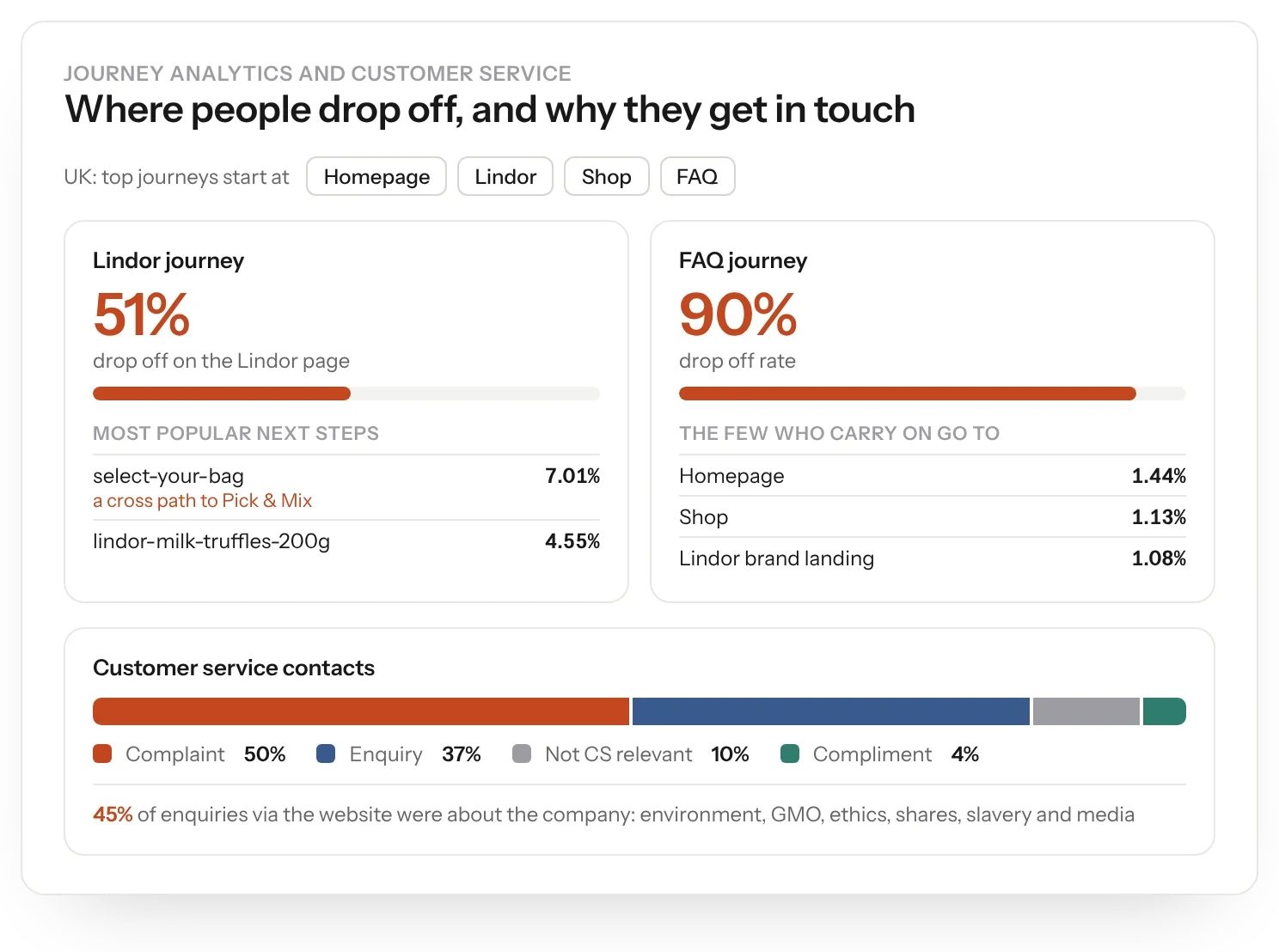
51%
of visitors dropped off on the Lindor page
-
90%
drop-off on the FAQ journey
-
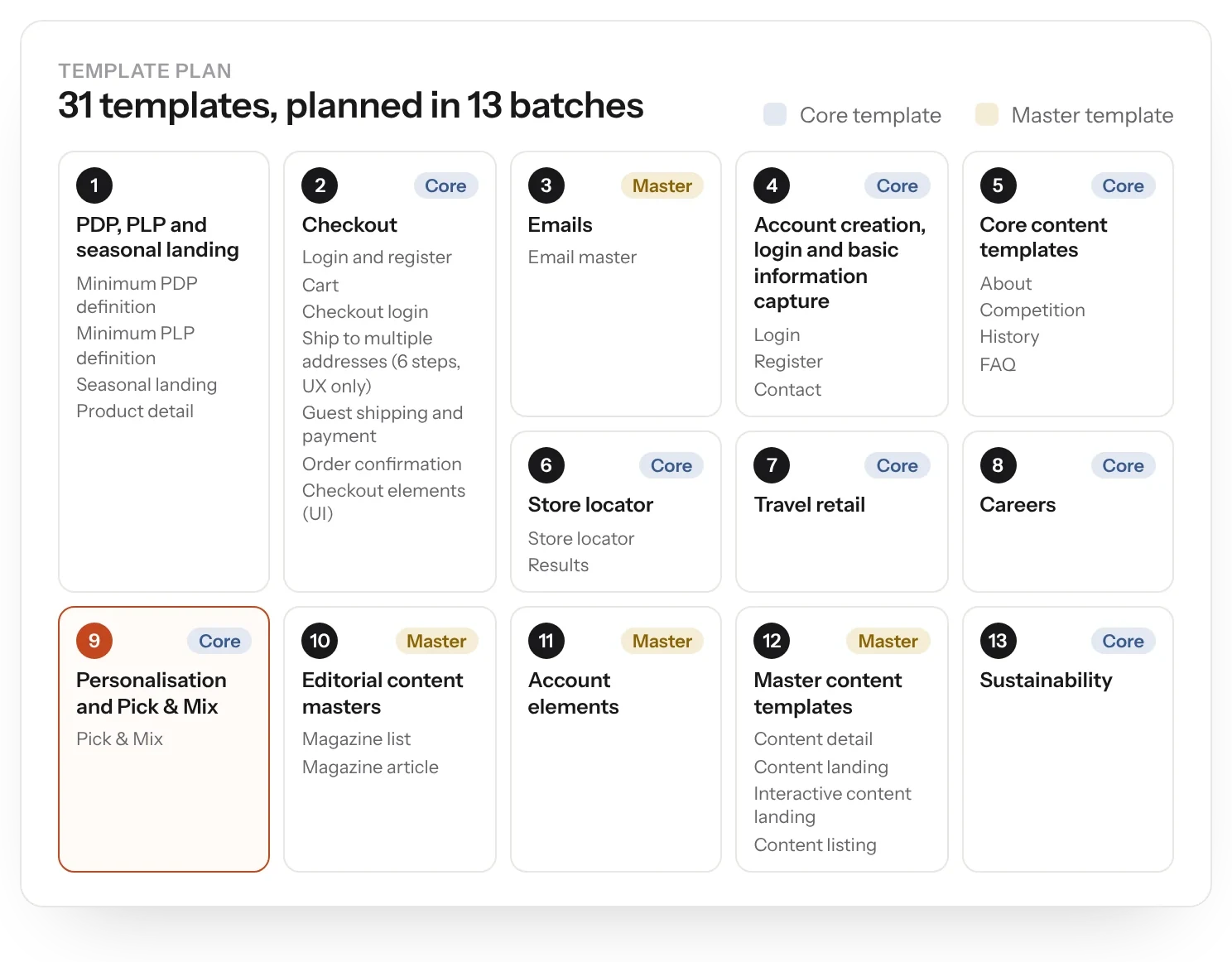
31
templates, planned in 13 batches
-
7
recommendations from a Pick & Mix audit against Baymard's 656 guidelines
The brief
Lindt was moving its country sites to a new platform. We set the user experience approach for the shops and the corporate site, from research and workshops with key stakeholders in Zurich.
The challenge
51% of visitors dropped off on the Lindor page, and the FAQ journey lost 90%. Half of customer service contacts were complaints, and 45% of web enquiries were about the company itself: the environment, GMO and ethics.
My role
My experience department at Born ran this work. I set the UX strategy and led the research and the Zurich workshops with the team.
I articulated it in a UX overview for the country sites: proto-personas, sitemaps for markets with and without a shop, a corporate site plan and a 31-template build plan, then designed the product page in detail.
What we did
- Analysed site analytics and customer service contacts across Lindt's markets.
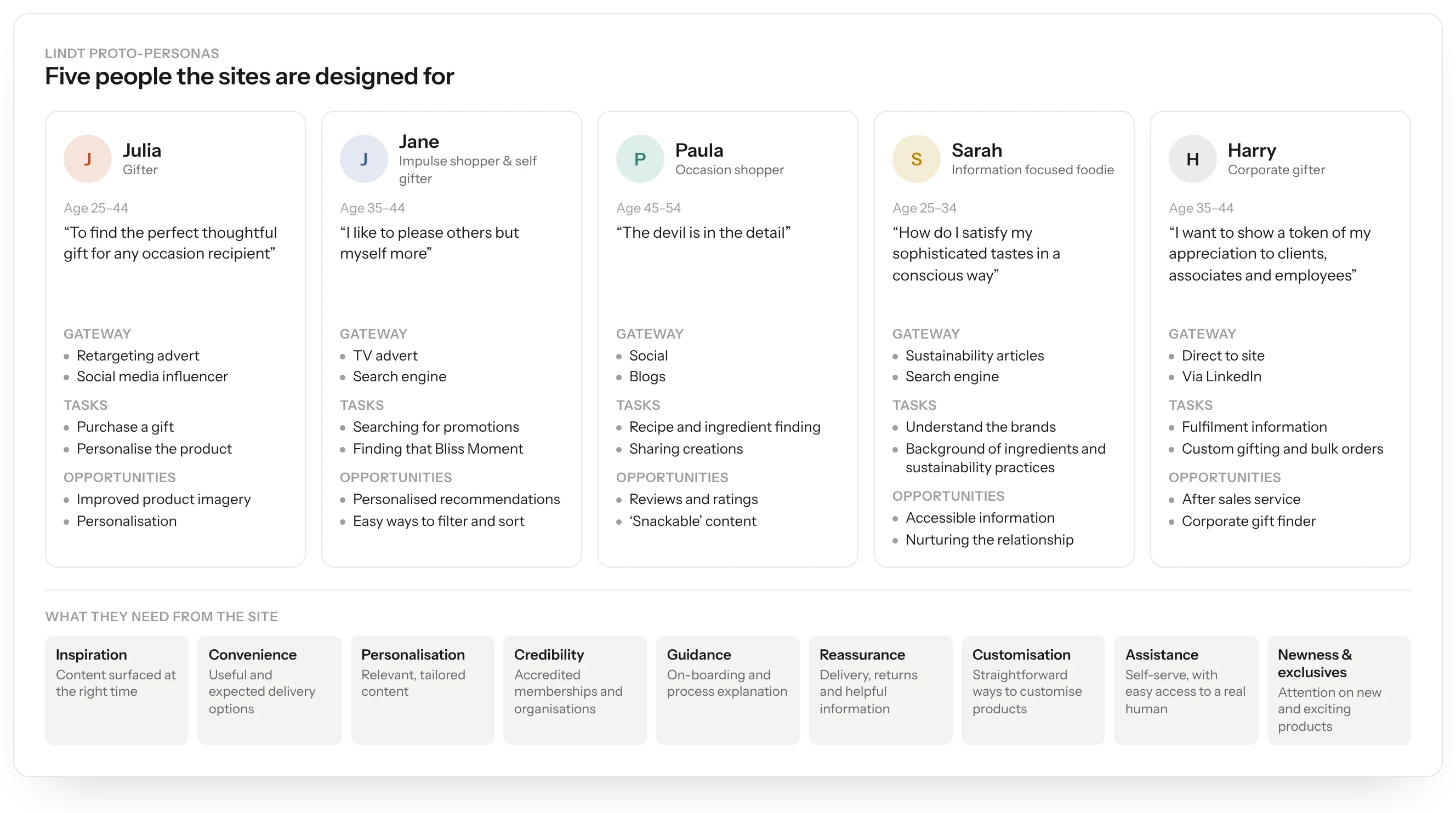
- Built five proto-personas, from Julia the gifter to Harry the corporate gifter.
- Defined sitemaps for markets with and without an online shop, and for the corporate site.
- Planned 31 templates in 13 batches, including Pick & Mix, multi-address checkout and a store locator.
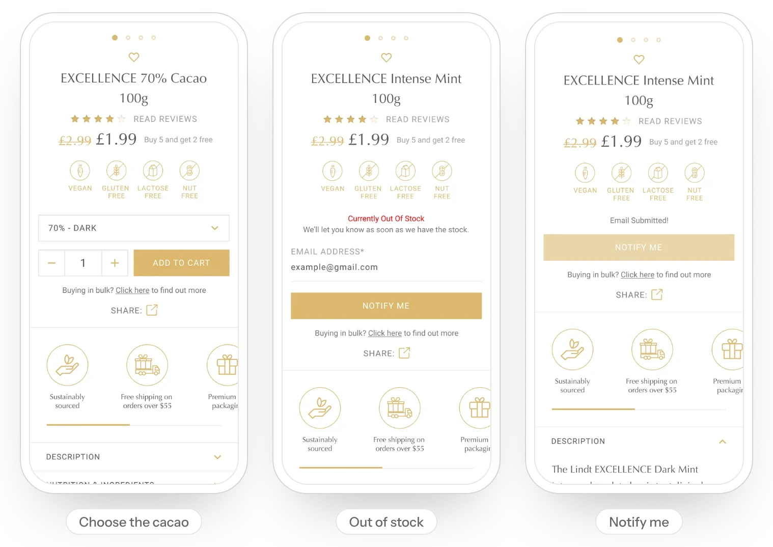
- Designed the product page for desktop and mobile, from choosing a cacao percentage to out-of-stock alerts.
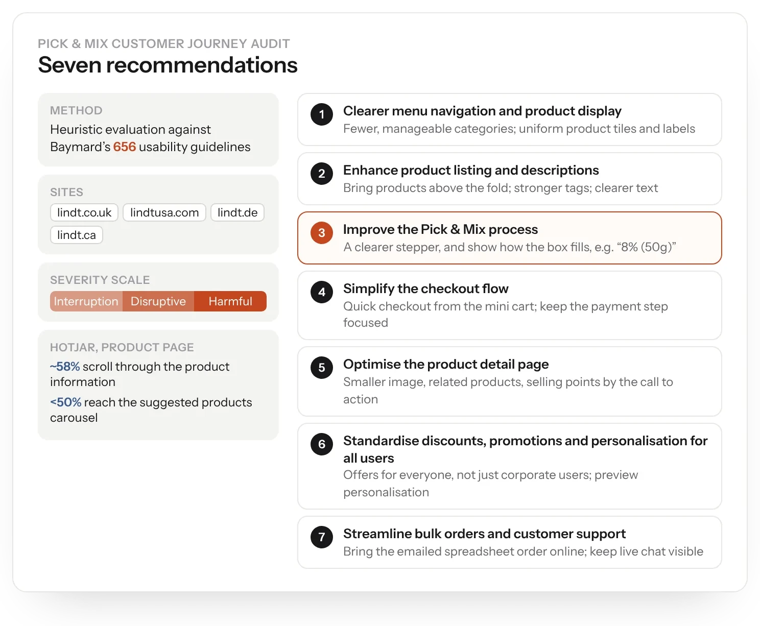
- Audited the Pick & Mix journey against Baymard's 656 guidelines and made seven recommendations.
The data
The data pointed straight at the problems. Half of visitors left the Lindor page, and the FAQ journey had a 90% drop-off. Customer service contacts were 50% complaints and 37% enquiries, and 45% of web enquiries were about the company: the environment, GMO and ethics.
Personas
Five proto-personas captured why people buy chocolate online: Julia the gifter, Jane the impulse shopper treating herself, Paula the occasion shopper, Sarah the information-focused foodie and Harry the corporate gifter.
Corporate site
The corporate site served a different audience: researchers, investors, job seekers and people checking Lindt's responsibility record. 84% were new visitors and 66% were on desktop. The homepage drew the most views, followed by the about pages, careers and investor relations.
Templates
We planned 31 templates in 13 batches, from Pick & Mix and multi-address checkout to a store locator, with separate sitemaps for markets with and without an online shop.
Product pages
We then designed the product page in detail, for desktop and mobile: choosing a cacao percentage, dietary badges, multi-buy offers, a route for bulk buyers, and out-of-stock alerts that take an email and confirm it.
It covered Excellence, Lindor, pralines with a personalised ribbon and the Gold Bunny, with a version for markets without an online shop and bundle pages explored as carousels, accordions and tabs.
Pick & Mix
Later, we audited the Pick & Mix journey on the UK, US, German and Canadian sites against Baymard's 656 guidelines. Hotjar showed around 58% of visitors engaged with product information, but fewer than half reached the suggested products carousel.
Seven recommendations followed, covering navigation, listing pages, a Pick & Mix stepper, checkout, product pages, discounts and personalisation, and bulk orders.
The result
Every country site got the same foundations: five proto-personas, sitemaps for markets with and without a shop, 31 templates planned in 13 batches and a detailed product page. The Pick & Mix audit then gave the team seven clear fixes for one of Lindt's most distinctive journeys.