At a glance
-
35%
of traffic went to postpaid plan pages
-
7
key journeys mapped, from a new phone on postpaid to switching to Digi
-
74
features prioritised: 69 should-haves and 5 could-haves
The brief
Digi was moving its website to a new platform: the public site, and My Digi, where customers manage their account, usage, bills, reloads and family groups. We set the user experience approach, built on research and stakeholder workshops.
The challenge
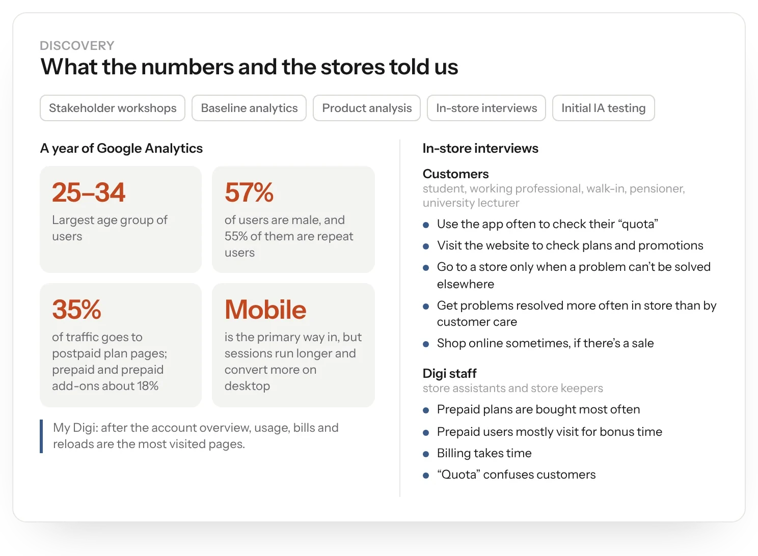
Most people arrived on mobile, but more converted on desktop. Postpaid plan pages took 35% of traffic. The site had to work for very different people, from a busy parent after the best value to a trend setter and a budget shopper.
My role
My experience department at Born ran this work. I set the UX strategy and led the stakeholder workshops and in-store research with the team.
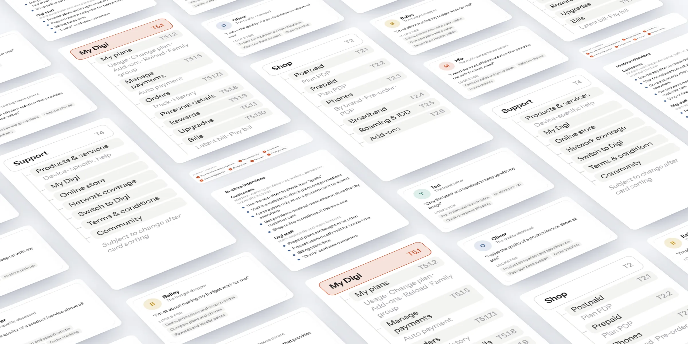
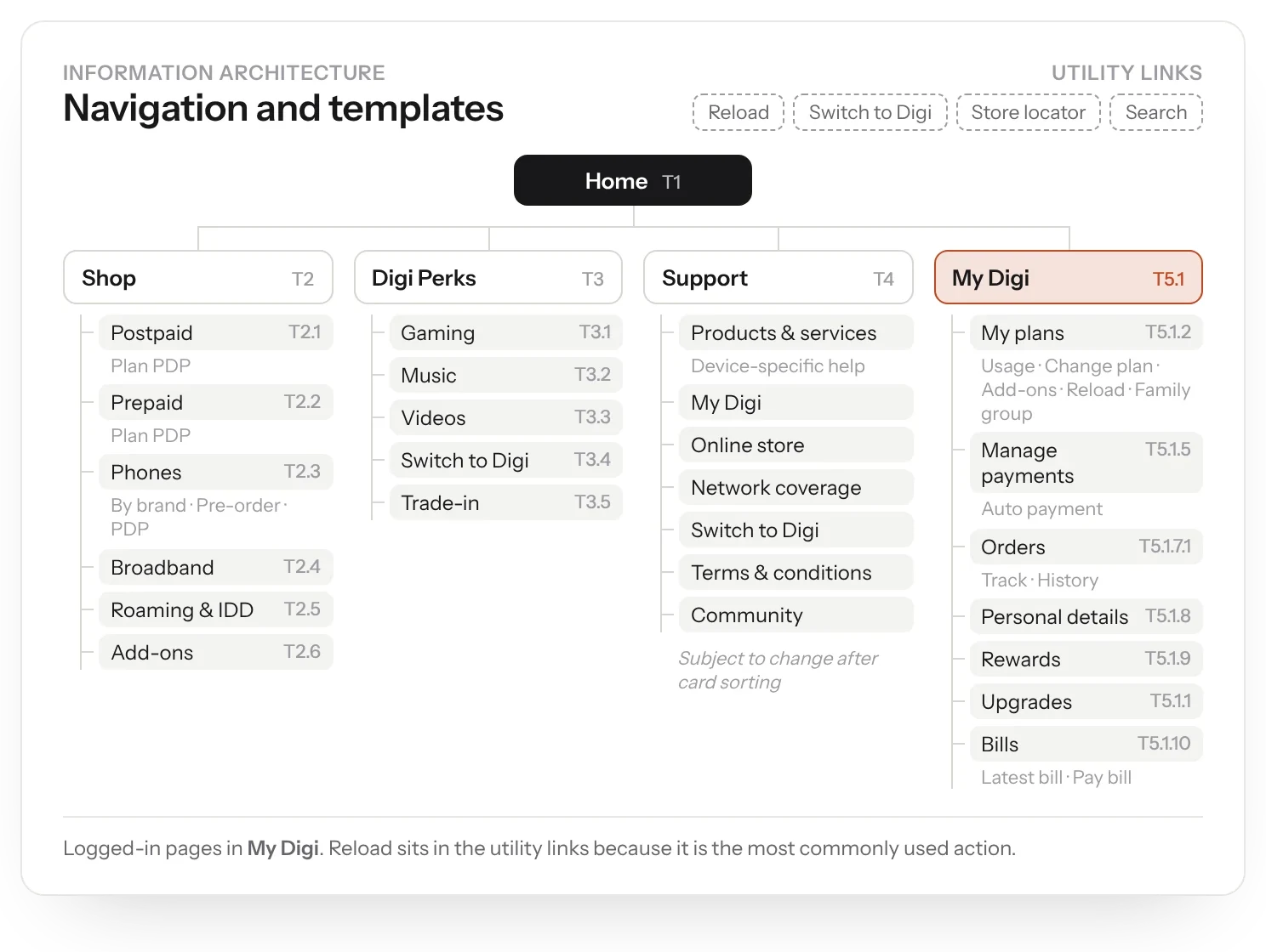
I articulated it in a UX strategy: personas, seven journey maps, a 74-feature plan, the sitemap, content modules and a template inventory.
What we did
- Ran stakeholder workshops and set a baseline from a year of analytics.
- Interviewed customers and store assistants in Digi stores, from a student and a pensioner to a working professional and a lecturer.
- Built four personas and mapped seven key journeys, from a new phone on postpaid to switching to Digi.
- Prioritised 74 features (69 should-haves, 5 could-haves) and turned them into a sitemap, content modules and templates.
- Planned card sorting to test the support navigation.
Research
We started with the numbers. A year of analytics showed the largest age group was 25 to 34, 57% of users were male, and most people came on mobile even though more of them converted on desktop.
Then we went in store, interviewing customers and the assistants who help them choose.
Personas and journeys
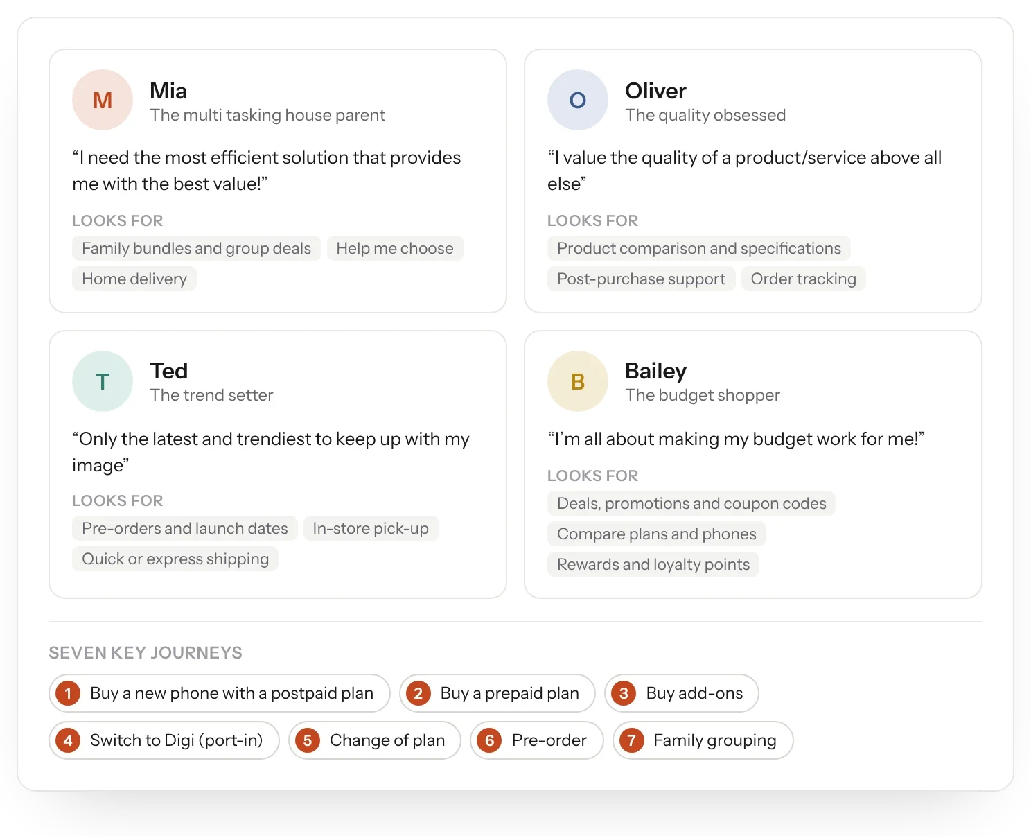
Four personas came out of the research. Mia, the multitasking parent: “I need the most efficient solution that provides me with the best value!” Oliver, obsessed with quality. Ted, the trend setter. And Bailey, the budget shopper: “I'm all about making my budget work for me!”
We mapped seven journeys against them: a new phone on postpaid, buying prepaid, buying add-ons, switching to Digi, changing plan, pre-ordering and family grouping.
Principles
Three principles guided the design. Guided assistance: help on hand when choosing a phone or plan or switching to Digi, with tutorials, contextual search and FAQs in support. Product modelling: show which plans and add-ons suit each customer, and why. Task optimisation: get common tasks done in one place, with step-by-step guides and progressive disclosure.
Structure
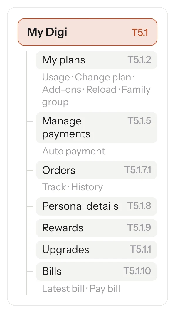
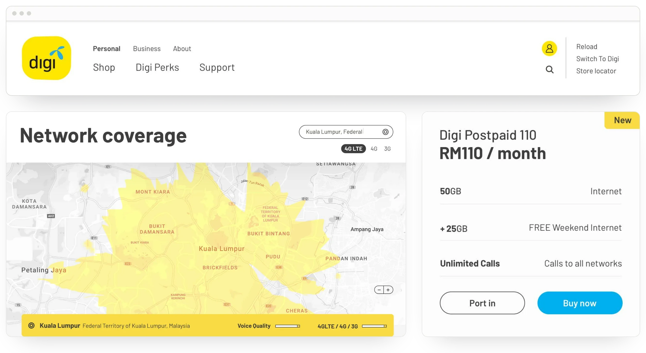
A 74-item feature list became the sitemap, content modules and a template inventory, with the support navigation left open to card sorting. The creative followed a “mobile always” direction.
The result
A blueprint for the re-platform: four personas, seven journeys, 74 prioritised features, a sitemap and a template inventory, all traced back to research and ready for design and build.