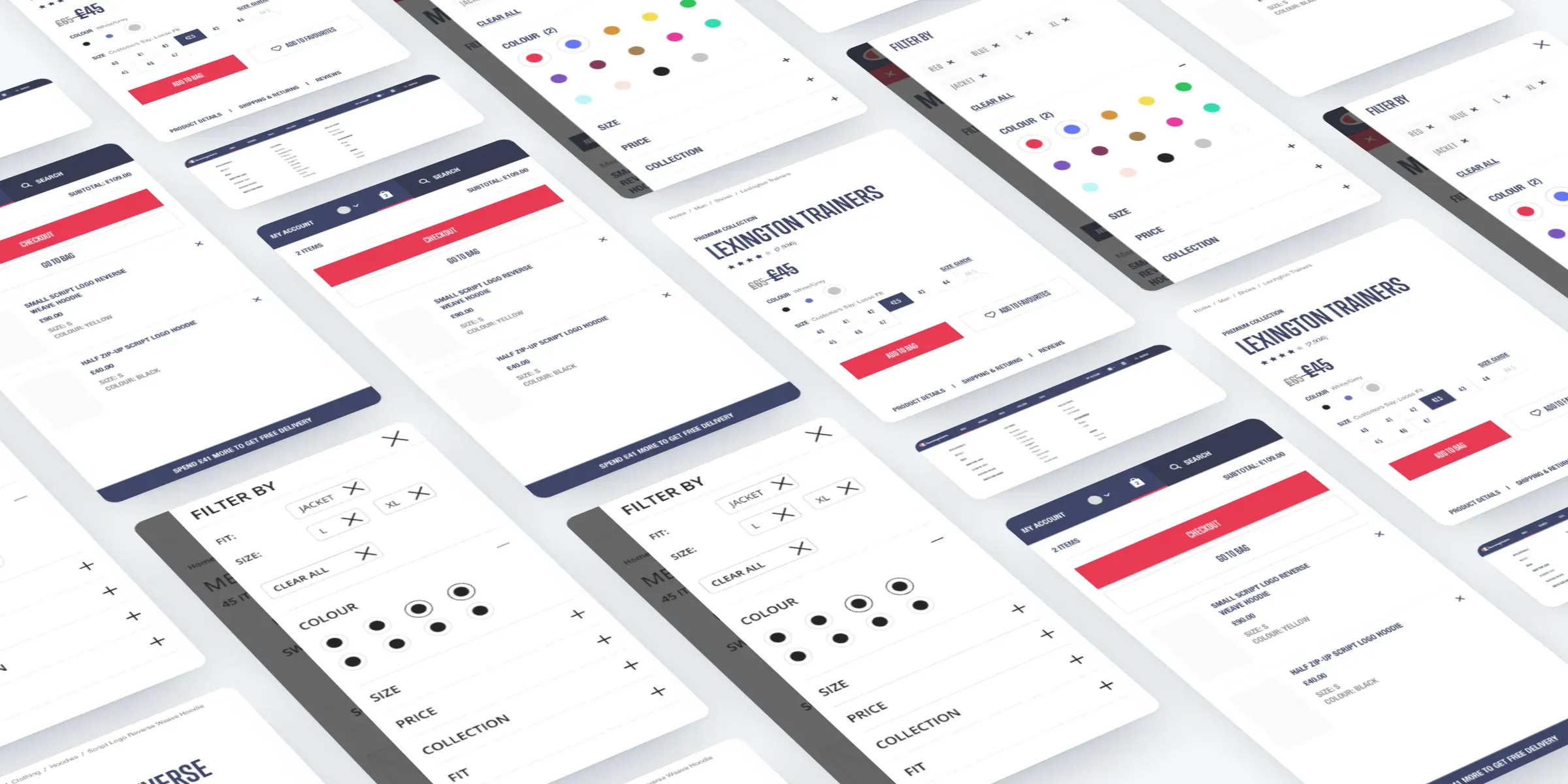
At a glance
-
12–14
days customers were taking to convert
-
65%
of visitors on mobile
-
81%
of visitors were returning customers
-
24
templates, plotted by priority and effort and designed in four batches
The brief
Champion was moving to a new global e-commerce site. After the pitch, we ran a discovery workshop with Champion's e-commerce team to agree what the site had to achieve, who it was for and what to design first. Then we designed it, for desktop and mobile.
The challenge
Customers were taking 12 to 14 days to convert. Champion wanted richer collection stories, an easier checkout, fewer abandoned baskets and personalised merchandising through Nosto.
Footwear had to be easier to find, and key pages had to balance content with commerce, and usability with the brand's tone of voice.
My role
My experience department at Born ran this work. I set the UX strategy and led the discovery workshop and research with the team.
I articulated it through proto-personas, an analytics review, a prioritised template plan, and wireframes and UI for desktop and mobile.
What we did
- Ran a discovery workshop with Champion's e-commerce team to set goals and priorities.
- Built four proto-personas around Champion's collections: Legacy, Rochester and Premium.
- Reviewed the analytics: 65% of visitors on mobile, 81% returning, and hoodies the top search.
- Plotted 24 templates by priority and effort, and grouped them into four design batches.
- Designed desktop and mobile, from the mega menu, search and filters to product pages, the mini basket, checkout and account.
Discovery
A questionnaire went to Champion first, on brand, tone of voice, product lines and competitors. The workshop then set the goals: shorten the conversion window, explain each collection at every point in the journey, use media and seasonal content better, cross-sell between ranges and show clearly what the business is pushing. Footwear needed its own stories, with apparel leading people to it.
Personas
We built the proto-personas as a project team, so everyone could bring their own view of the customer.
Mario Rossi wears Champion's legacy pieces every day, trusts the quality and wants a little guidance but no hand-holding. Michelle and Mike are young Rochester customers who want limited editions and shop on their phones. Polly and Pierre buy Premium: Polly needs clothing that works from the gym to a night out, and Pierre wants quality over logo, product zoom, free delivery and easy returns.
The data
The analytics backed this up. 65% of visitors were on mobile, and the most common screen was an iPhone at 375 by 667 pixels. iPhone visitors converted at 0.61%, against 1.83% on a 1440 by 900 desktop screen, so mobile had the most to gain.
81% of visitors were returning customers, and hoodies, sweatshirts, kids, joggers and jackets topped site search.
Conversion by screen
The most common desktop and iPhone screens
View as a table
| Screen | Conversion rate |
|---|---|
| Desktop, 1440 by 900 | 1.83% |
| iPhone, 375 by 667 | 0.61% |
Templates
We plotted 24 templates by priority and effort, from the product listing and separate product pages for the Rochester and Premium collections to editorial, account and the store locator. They went into four batches. The first covered the UI library, header and footer, menus, homepage and mini basket. The others grouped product pages, listings and checkout; editorial and category pages; and account, Nosto and the store locator.
Browsing
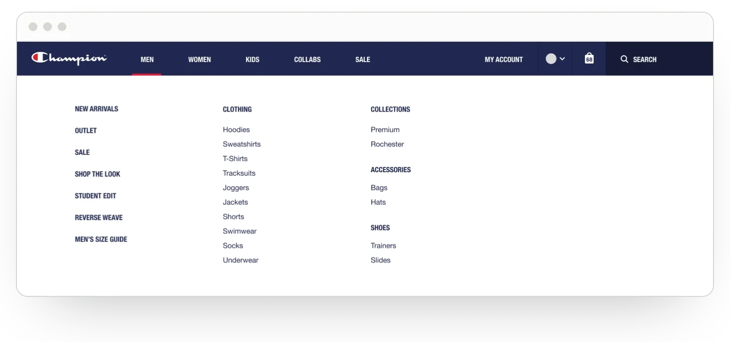
The mega menu puts shoes and the collections next to clothing, with quick routes to new arrivals, sale, the student edit and Reverse Weave. Collabs get their own section.
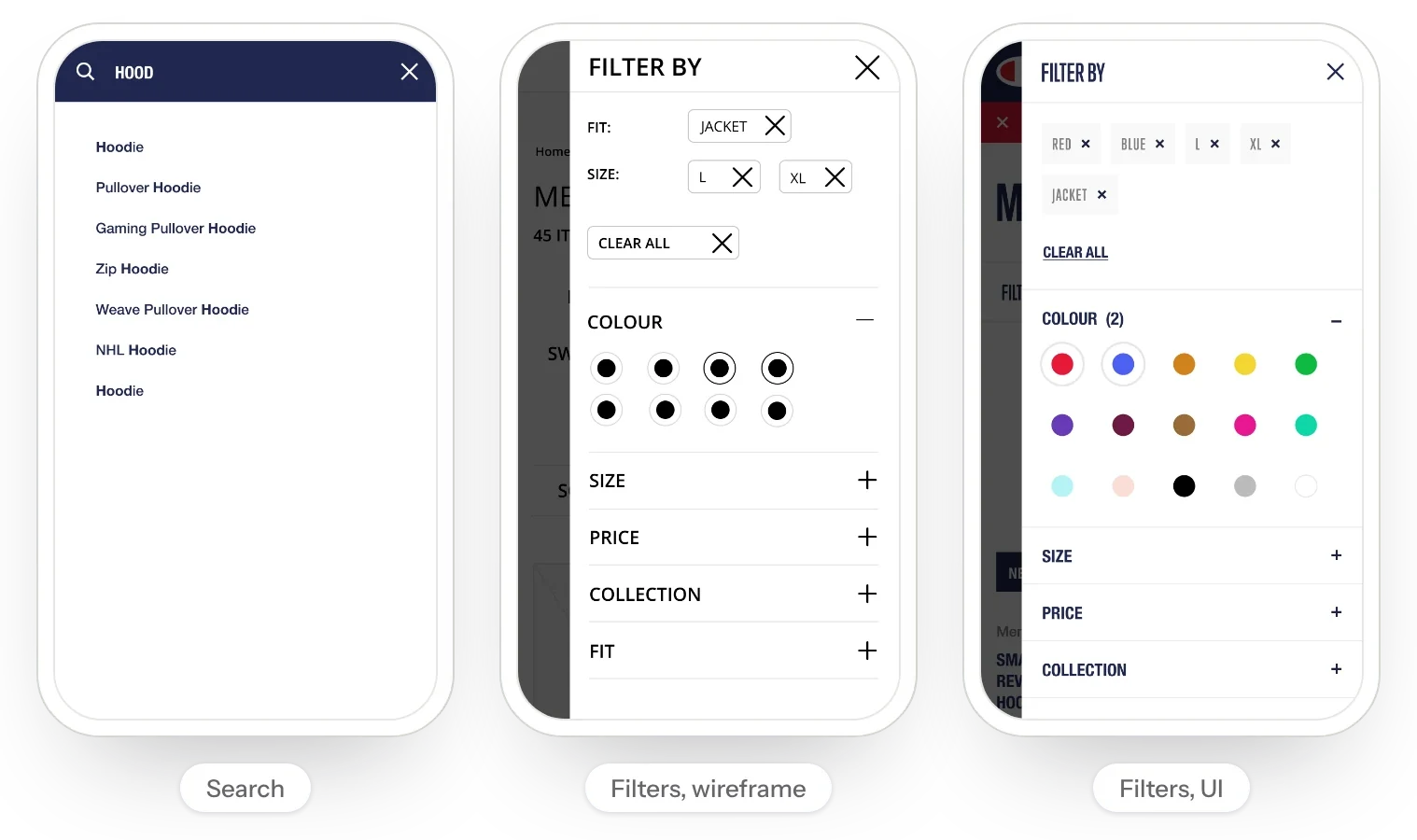
On mobile, search suggests matching terms as you type. Filters show what's applied as tags you can clear, with colour swatches instead of a list. On listing pages we tried different image crops, name lengths and colour counts.
Buying
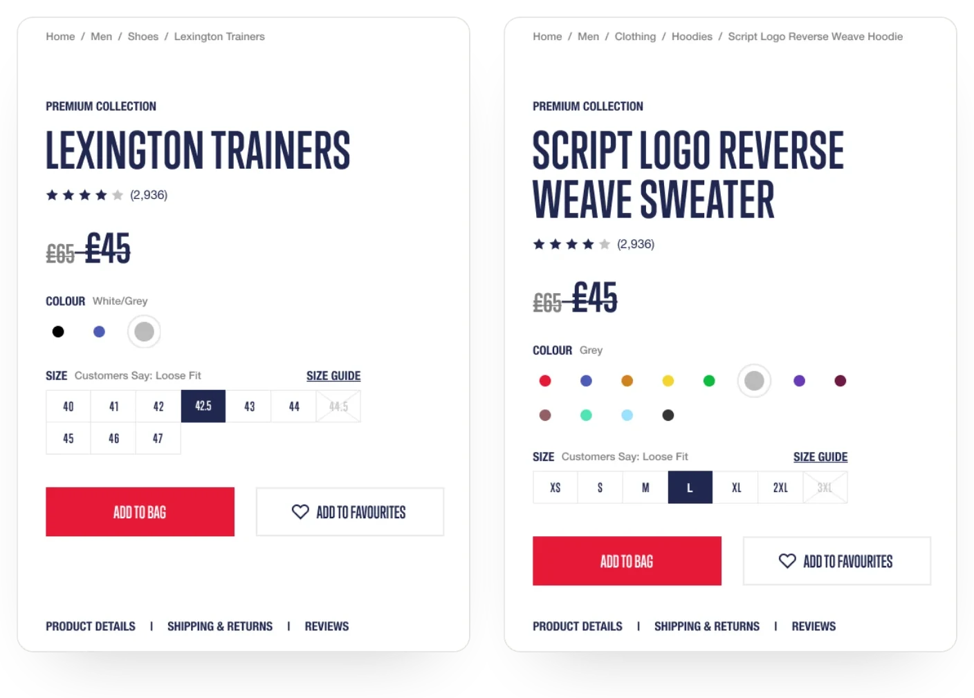
Product pages came in several versions: simple and configurable products, out of stock, collaborations, zoom, shoe sizes and customer questions. Sizes carry a fit note from customers, and unavailable sizes are crossed out.
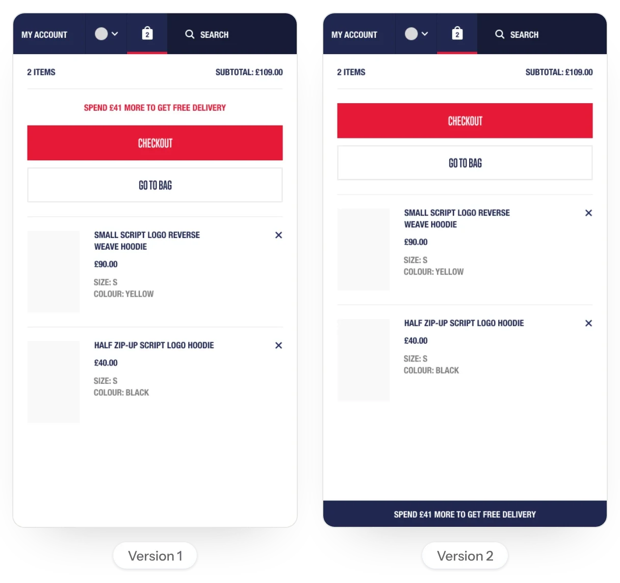
The mini basket keeps the free delivery threshold in view, at the top of the panel or fixed to its foot. Checkout, the bag, account pages, favourites and the store locator completed the set.
The result
Champion got a shared view of its goals and customers, a prioritised plan for 24 templates, and designs for desktop and mobile across all four batches: from navigation and search to product pages, the mini basket, checkout and account.