At a glance
-
2
page structures: a long, story-led page and a shorter one
-
5
groups of components: campaign, collection, product, Cartier and UX
-
10
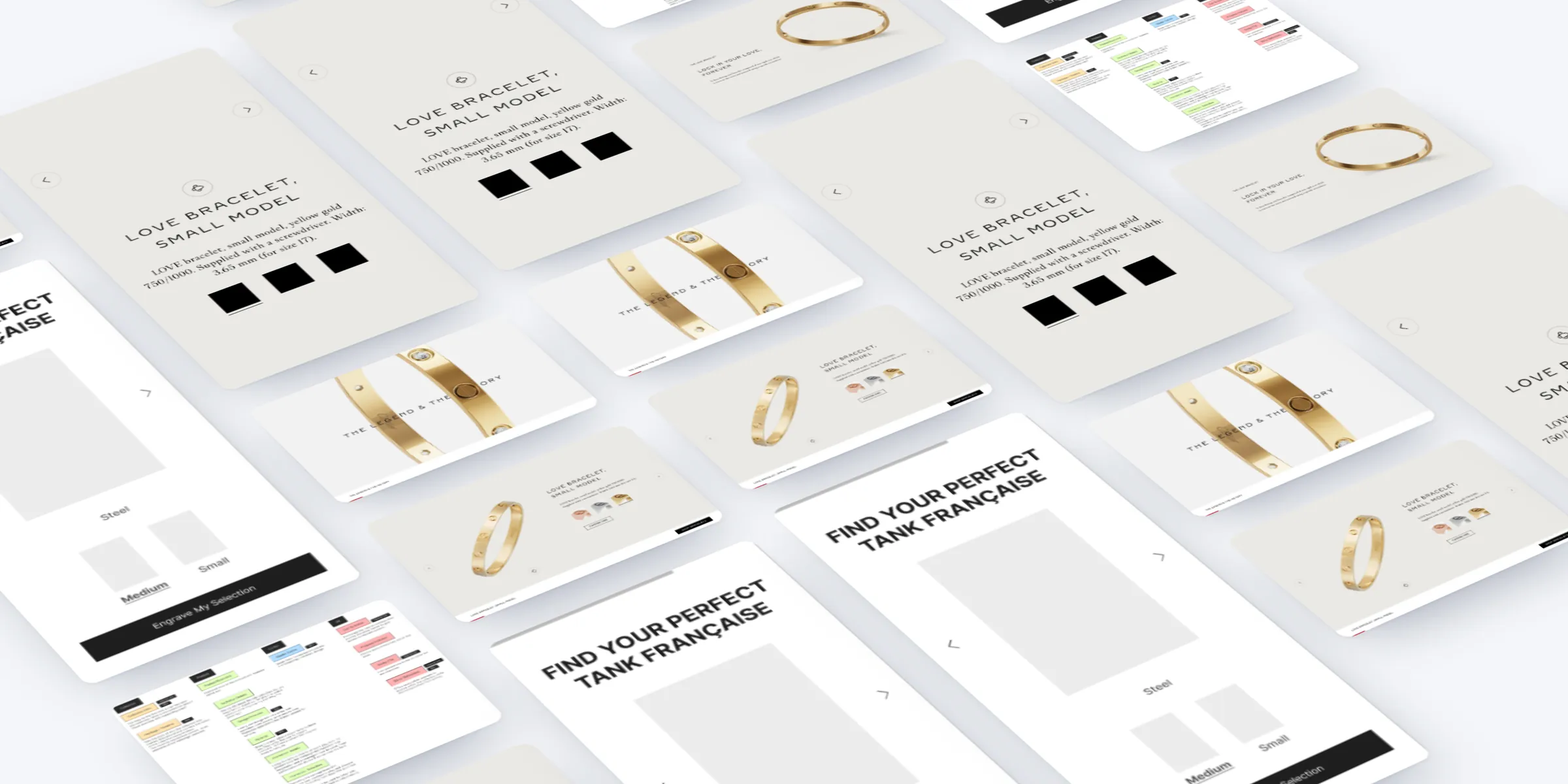
components wireframed for mobile and desktop, from the video hero to a guided search
The brief
Cartier wanted collection pages that do more than show a campaign. Cartier Universe is a page format that gives campaign and commerce equal weight: the film, its talent and the collection's history, then the pieces themselves, with a route to buy throughout.
The challenge
People arrive with different intent. Some come for the film, some already know what they want, and some need convincing once the story has caught their eye.
The page had to work for all of them, on a phone first, with campaign assets that arrived in waves. And it had to lead somewhere: a product, a boutique appointment or another collection, never a dead end.
My role
My experience department at Born ran this work. I set the experience strategy and led the workshops with the team.
I articulated it through a review of current campaign pages, content hierarchies, a component and content model, component and device wireframes, UI templates and the UI for the Love collection, on desktop and mobile.
What we did
- Reviewed Cartier's Santos and Love campaign pages against storytelling pages from Apple, Louis Vuitton and TAG Heuer.
- Planned two page structures: a long, story-led page and a shorter one closer to Cartier's current campaign pages.
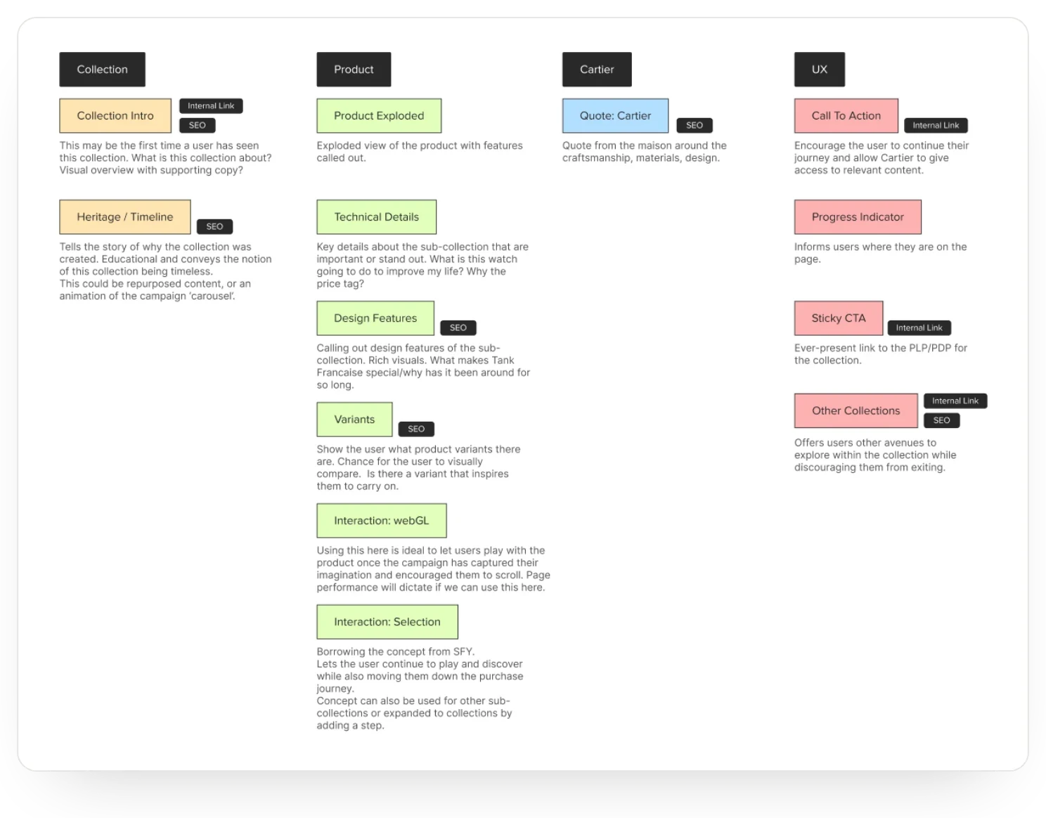
- Modelled campaign, collection, product and UX components, each with its reason, its benefit and its value for search and internal links.
- Mapped every campaign asset, from the main film to behind-the-scenes stills, to a component.
- Wireframed ten components for mobile and desktop, from the video hero to a guided search.
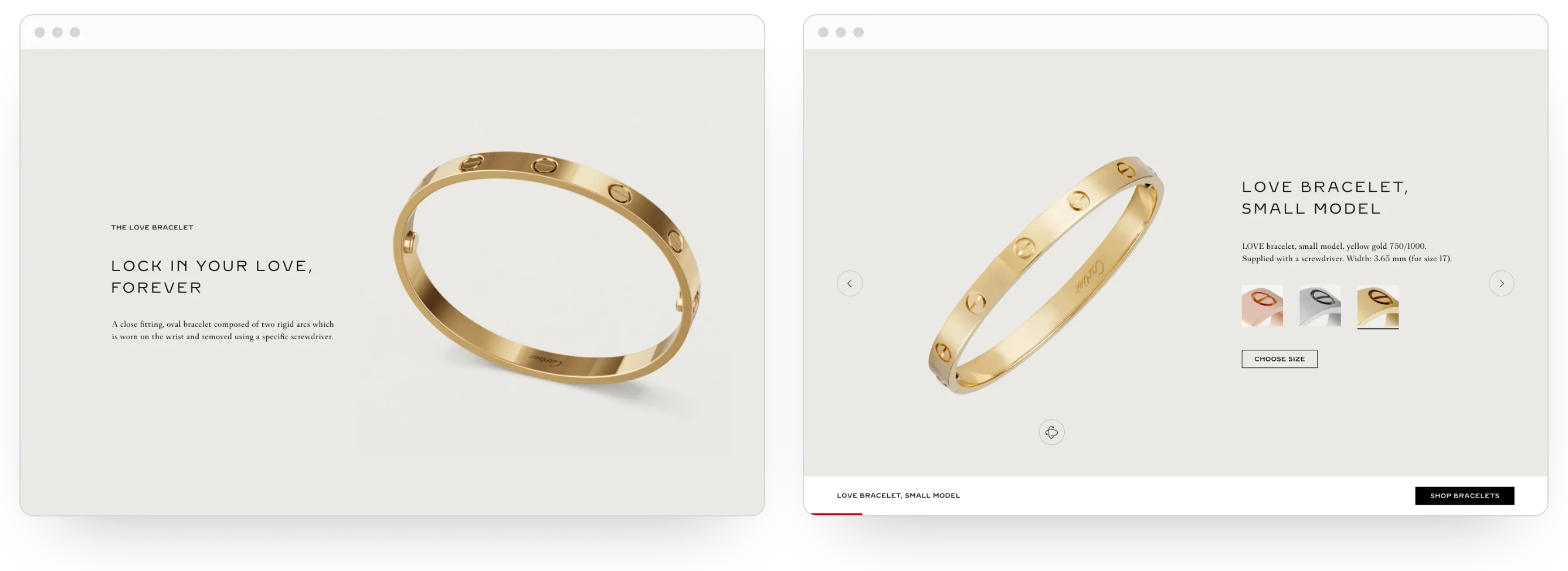
- Designed the format for the Love collection, on desktop and mobile.
Benchmarks
Cartier's Love and Santos campaign pages followed a familiar pattern: a hero image, an intro, the film, two-column videos with copy, a carousel, four products and a link to the listing.
We set those against long-form storytelling from Apple, Louis Vuitton and TAG Heuer, to see what a fuller story could add.
Page structure
Two structures came out of it. The first was a longer page in the spirit of Apple's storytelling: an intro and teaser, then the film and its actors, then the product, from heritage and design to materials and variants, ending with an interaction that leads to purchase.
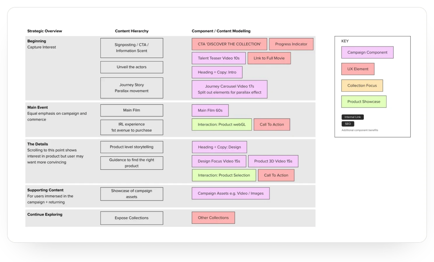
The second was shorter, closer to Cartier's current pages, in five parts: capture interest, a main event with equal emphasis on campaign and commerce, the details for people who need more convincing, supporting content for those immersed in the campaign, and a way to keep exploring.
Components
We modelled the content as components in five groups: campaign, collection, product, Cartier and UX. Each came with its reason and its benefit, including whether it helped search or internal linking.
An exploded view, technical details and variants answer why this watch, and why the price. A sticky link to the collection stays in reach, and other collections give people somewhere to go next.
Campaign assets arrived in two waves. We mapped each one, from the main film to behind-the-scenes stills, to a component, and flagged what went unused.
Guided search
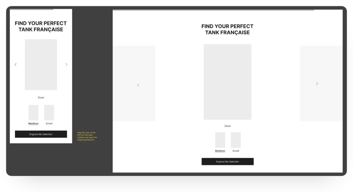
Wireframes followed for each component, on mobile and desktop: a full-screen video hero, character intros, a parallax timeline, product cards that slide up like tanks seen from above, a gallery and other collections.
The guided search borrowed from Set For You. “Find your perfect Tank Française” lets people choose a material and a size, then engrave their selection, so the first steps of buying happen inside the story.
Love
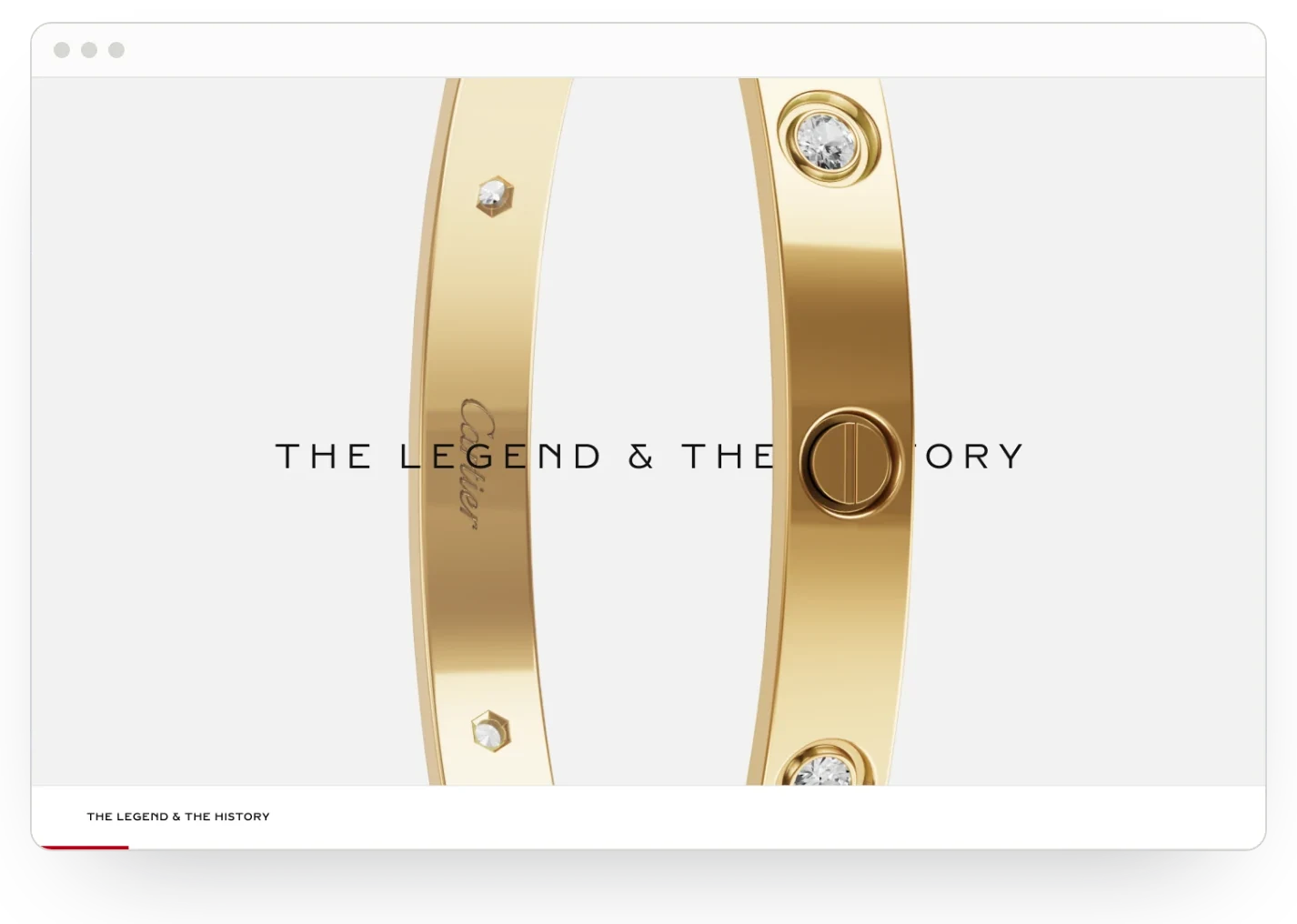
The format then came to life for Love. The page opens on the campaign, moves through the legend and history of the bracelet, then shows each piece with its materials and a choice of size. Bracelet stacking and ring pairings show how pieces work together.
A sticky bar names each section and offers the right shop link, from necklaces to rings, and booking a boutique appointment is never far away.
The result
A reusable format for Cartier's collection pages, backed by a component model, wireframes for mobile and desktop, and a full design for Love. Each campaign can pick the components its assets support, and every page leads to a product, a boutique or another collection.